 TikTok Ads
You open the desk demonstration that is pulling in viewers and product visits, then look at the orders it brings. There are precious few worth having. Before you ask for a sharper opening or another creator, try taking the journey your video has just sold.
The audience or the proposition could be wrong. Equally, an interested shopper could be meeting a particular obstacle on your website. A conversion audit, a review of that buying route, helps you separate things you can show are broken from missing information and ideas you still need to test.
That is a much more useful conversation than “make the content more engaging”.
Pin down what the viewer was promised
Keep the exact video, caption and destination you are reviewing together. Identify the product, configuration and use a viewer would reasonably take from them. You need an actual route to examine, rather than a general drawing of how your marketing ought to work.
Take a hypothetical folding desk. Does the demonstration show a particular size, finish or accessory? What does its opening lead an interested person to expect when they click? That expectation gives you something concrete to judge the page against.
A handsome view count does not establish that you reached people ready and able to buy. This review asks whether someone interested can continue sensibly. It cannot prove that everyone watching had a relevant need or the money to act on it.
Try the page without your catalogue knowledge
Use the real link on a phone and inspect what opens. Can you recognise the demonstrated product, tell which option is selected and find the price for that option?
Go beyond checking that the page loads. Change the relevant size or finish. Watch what happens to the images and read the availability information. The address can be technically correct while the configuration choices remain thoroughly confusing.
Record the steps and what happened. “The page feels poor” leaves a developer guessing. “Selecting the advertised finish leaves the image and price unclear” gives the website team a specific question, with the right product reference, that they can reproduce and investigate.
Decide whether a fact is missing or badly explained
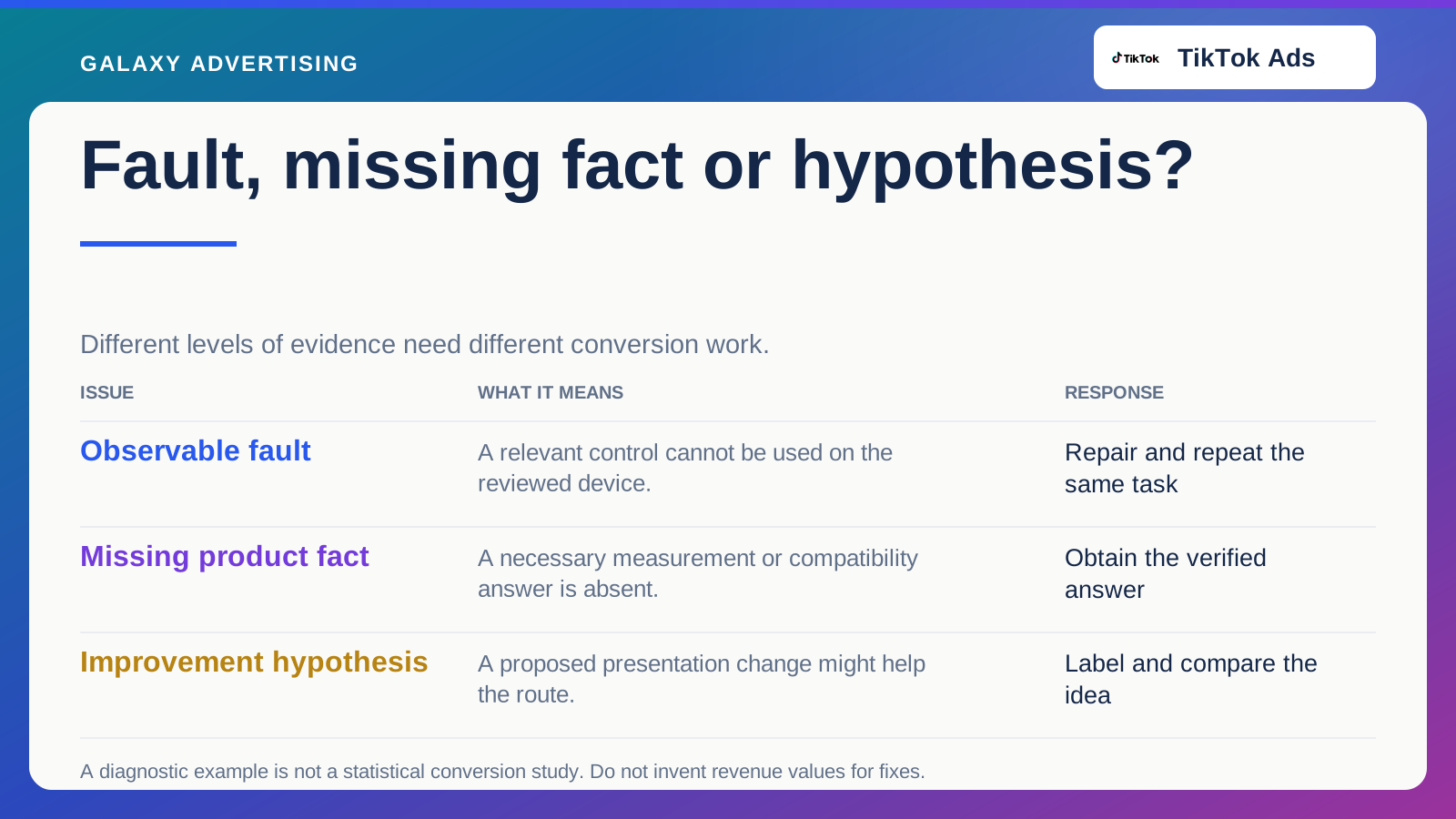
Write down what someone needs to assess this product. That could include dimensions, components in the package, documented compatibility and the relevant delivery arrangements. These are the practical details a considered purchase can depend on.
A missing measurement needs a verified answer. It is not simply a chance to write more persuasive copy. A vague quality claim is a different problem: the facts may be present, but their significance has not been explained.
Give those jobs to the appropriate people. Merchandising may need to confirm a specification; content may need to make its meaning clearer. Bundling everything into “optimise conversion” can hold up the factual correction and leave you unsure what a later test actually changed.
Find where the offer becomes different
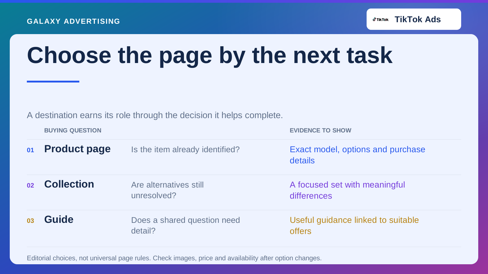
Compare the item shown with the item someone can select and order. Are there differences in the package, price or availability that the shopper has to untangle after the click?
Check when essential costs and service conditions become clear. You know your internal terminology. A new customer does not. The question is whether they can understand the practical offer when they need to, rather than whether the detail exists somewhere on your website.
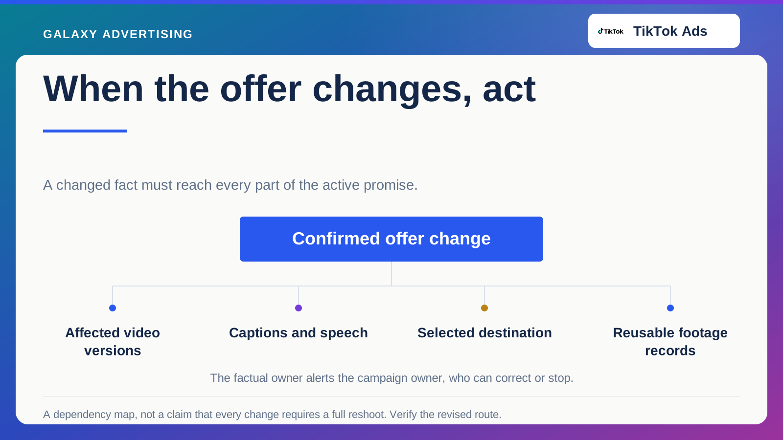
Where the advert and page describe different offers, fix that first. Until then, you are partly testing how well people navigate inconsistent information. That is a poor basis for a clean judgement about TikTok demand.
Keep a broken control separate from a hunch
A control you cannot use on the device being reviewed is an observable fault. The belief that another button colour would sell more is an improvement idea. Record them separately so their different levels of evidence remain visible.
Use analytics and customer evidence to help prioritise, while remembering what each can tell you. A departure point suggests where to investigate; it does not explain every departure. An enquiry can expose confusing wording without showing how many other shoppers struggled with it.
Do not attach an invented revenue value to every recommendation. Explain what supports it, why it matters and how you expect it to affect the route. You can then decide which corrections are necessary and which ideas deserve a comparison.
Fix the obstacle and check the same journey again
Give each material correction an owner and a repeatable acceptance check. If a finish was unclear, return to that item and make the same selection after the correction. Verify the result rather than accepting that a task has been marked complete.
Tell the campaign team when the change goes live. The destination has become materially different, so the next review needs to recognise that instead of blending all the results together.
Keep the work focused. Starting an audit is no reason to redesign navigation, price presentation and checkout together. A specific correction can make learning clearer than a wholesale transformation.
Bring in another person who has not designed the page. Give them the demonstrated product reference and ask them to find what they need for the intended buying decision. Watch where they need help without explaining the correct route beforehand. Their experience is a diagnostic example, not a statistical conversion study. Its value is uncovering a repeatable ambiguity that catalogue familiarity can hide.
Then ask whether the video makes the right argument
With the main factual and usability problems resolved, look again at the proposition. Does the available product genuinely serve the use being shown? Is the interest it attracts consistent with a commercially suitable purchase?
You may still need another argument, another product or a narrower test. A website audit should not spare weak acquisition thinking from scrutiny. Removing demonstrated obstacles simply gives you a firmer basis for that scrutiny.
Finish with corrections somebody owns and hypotheses clearly labelled as such. A customer who cannot understand or complete an offer needs something different from a customer who understands it and decides it is not for them. Your next move depends on knowing which problem you have.