Why should a shopper choose between two black loafers if your comparison calls both “versatile, refined and essential”? The page can look beautifully balanced while leaving them to infer the differences from photographs taken at different angles. That isn't much help with a choice.
Explain the documented distinctions and leave personal preference where it belongs: with the customer. Your job is to improve the information behind the decision, rather than manufacture a universal winner or pretend a comparison can determine personal fit. A focused page can be useful without settling everything.
Compare models that answer the same question
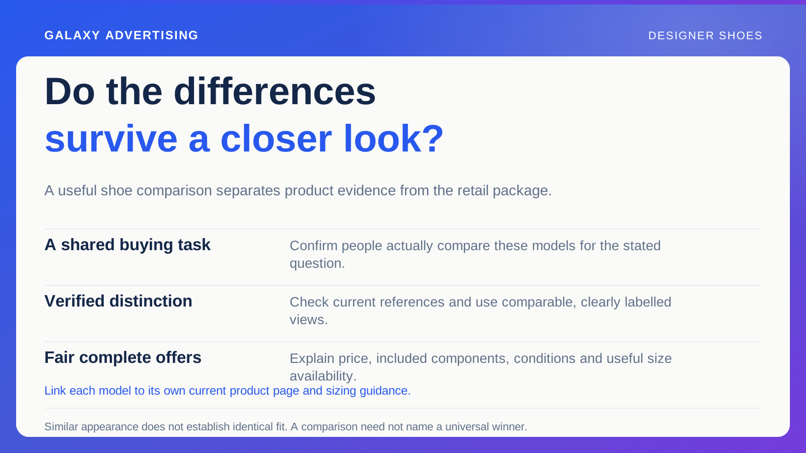
Use real enquiries and product exploration to identify pairs people genuinely compare. Matching colour or price doesn't establish the same styling task. Start with the practical question instead of choosing products merely because they fit neatly side by side on a page.
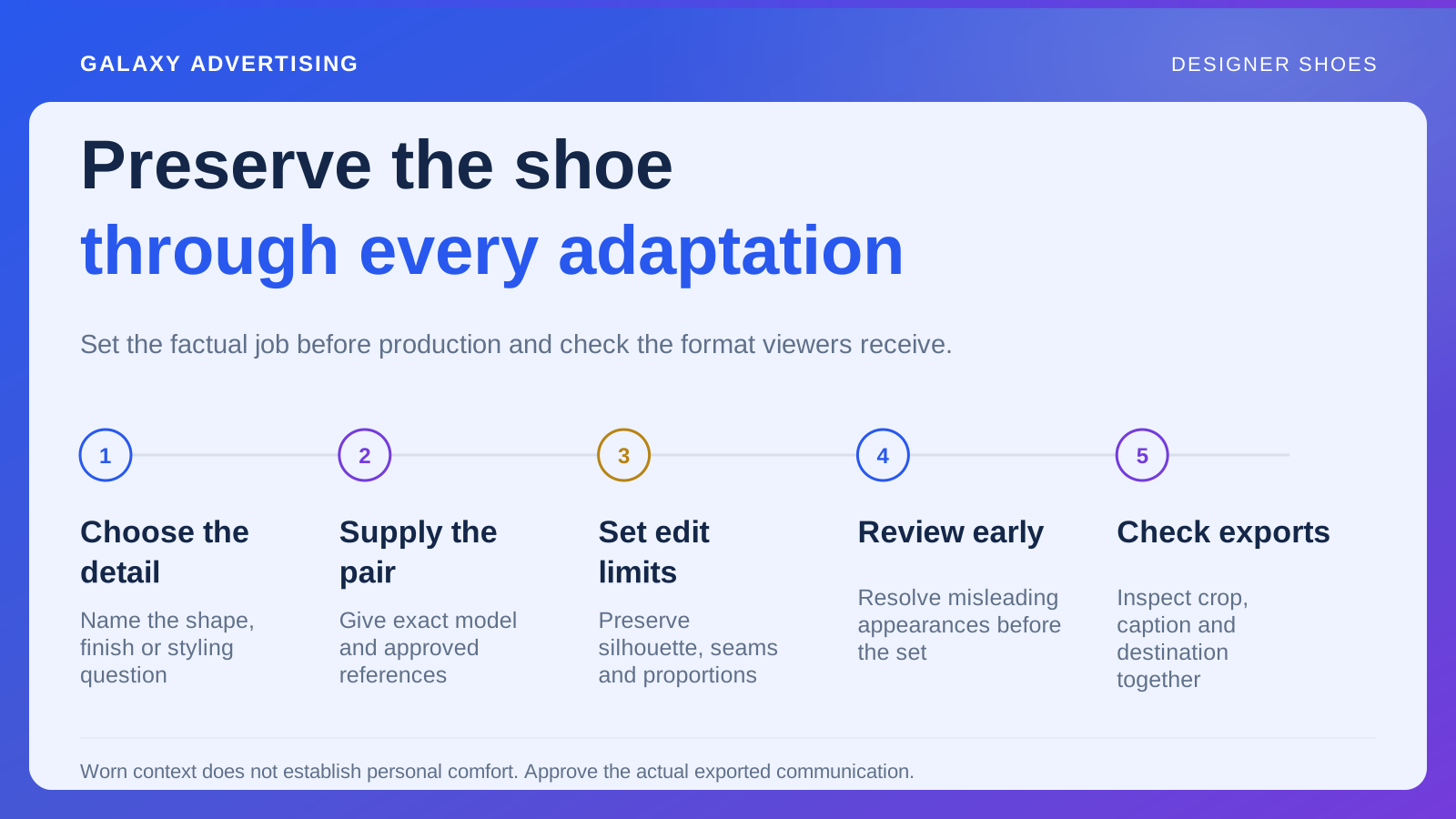
State the purpose plainly. You might explain silhouette, available materials or differences between versions in one range. A defined question lets you go deep enough to help without turning the guide into an exhaustive catalogue of everything the business sells.
Keep unrelated decisions out of the first brief. Explaining every shoe category, material and size convention at once can make the page too broad for someone comparing two identifiable pairs. More rows won't necessarily create more understanding. Resolve the distinction you chose before expanding the task.
Settle the facts before choosing a winner
Gather current model references, materials, visible details, available finishes and relevant manufacturer information. Give conflicts between page copy and source records an owner. A comparison built on unresolved discrepancies won't become reliable just because its layout is consistent.
Separate measurements from subjective descriptions. Report a verified dimension on its stated basis. “Elegant shape” is a judgement, rather than equivalent technical evidence. Both can have a place, but the reader should be able to distinguish what was measured from how somebody describes it.
Don't infer construction from appearance alone. If you can't verify a claim, omit or narrow it until an appropriate source is available. A tidy comparison structure shouldn't pressure the writer into filling every empty cell with an assumption. An honest gap is preferable to an invented difference.
Let the photographs support the comparison
Use relevant views with a consistent approach. Lighting, angle and retouching shouldn't become the main apparent distinction between the pairs. Keep actual model and finish labels beside images, so the shopper knows which evidence belongs to which item.
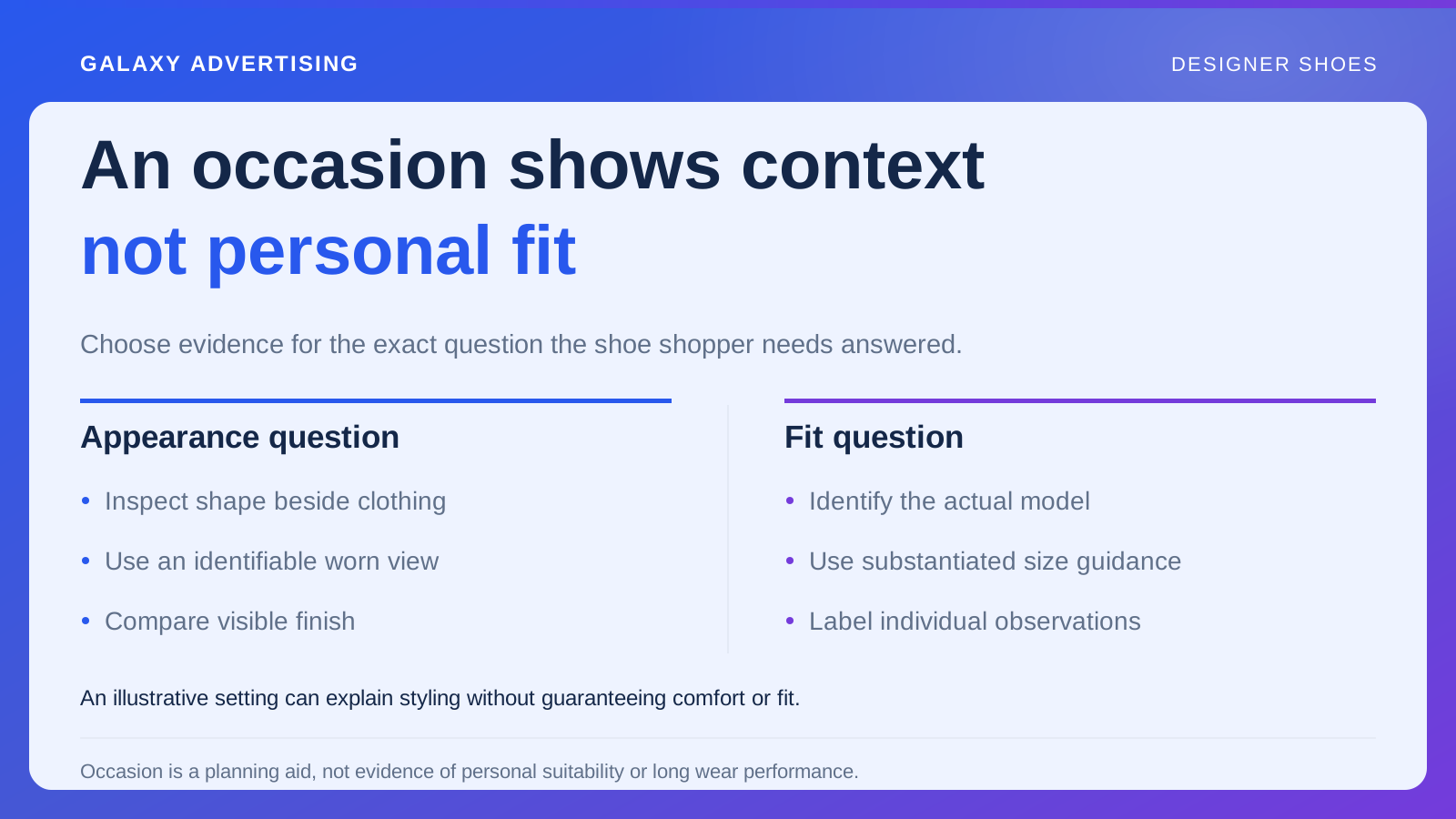
A comparable side or overhead view may explain silhouette better than unrelated lifestyle scenes. Worn views can provide context too, provided viewers can identify the model and understand what the scene allows them to judge. Each view needs a role in the chosen comparison.
Show the limits of visual evidence. Similar appearance doesn't establish identical fit. A photograph doesn't guarantee how a material will look in every setting either. Keeping those boundaries visible doesn't make the page unhelpful. It gives the customer a clearer account of what the evidence can establish.
Give both models a credible role
Explain the verified difference in ordinary language and relate it to the choice under discussion. Someone who prefers one visible shape can reasonably choose it even if the other costs more. Higher price doesn't need to become the page's hidden definition of the better answer.
Don't invent a weak alternative to make a preferred pair win. Give the reader a credible reason to consider each offer. If you can't explain a meaningful distinction, obtain more product facts before commissioning persuasive copy. More confident phrasing won't supply the missing comparison.
Keep personal recommendations within what you know. Styling illustrations and factual attributes can help without declaring which pair fits an individual or remains comfortable throughout an event. Unsupported certainty can undermine the whole explanation, including the accurate information around it.
Put the complete offers on a fair basis
Check price, included components and relevant purchase conditions consistently. If a pair is in a promotion, identify that condition. A temporary price shouldn't quietly become a permanent product characteristic in a guide that may remain live after the promotion ends.
Separate product differences from service differences. The same model sold in different retail packages creates a different question from two different models. Mixing those comparisons can make the price conclusion look more persuasive than its basis actually permits.
Give useful availability information. An apparently appealing alternative isn't equally purchasable when the required size is unavailable. The customer should understand that status without following several promotional links to discover the limitation. Price and appearance don't describe the whole practical offer.
Carry the distinction onto the product pages
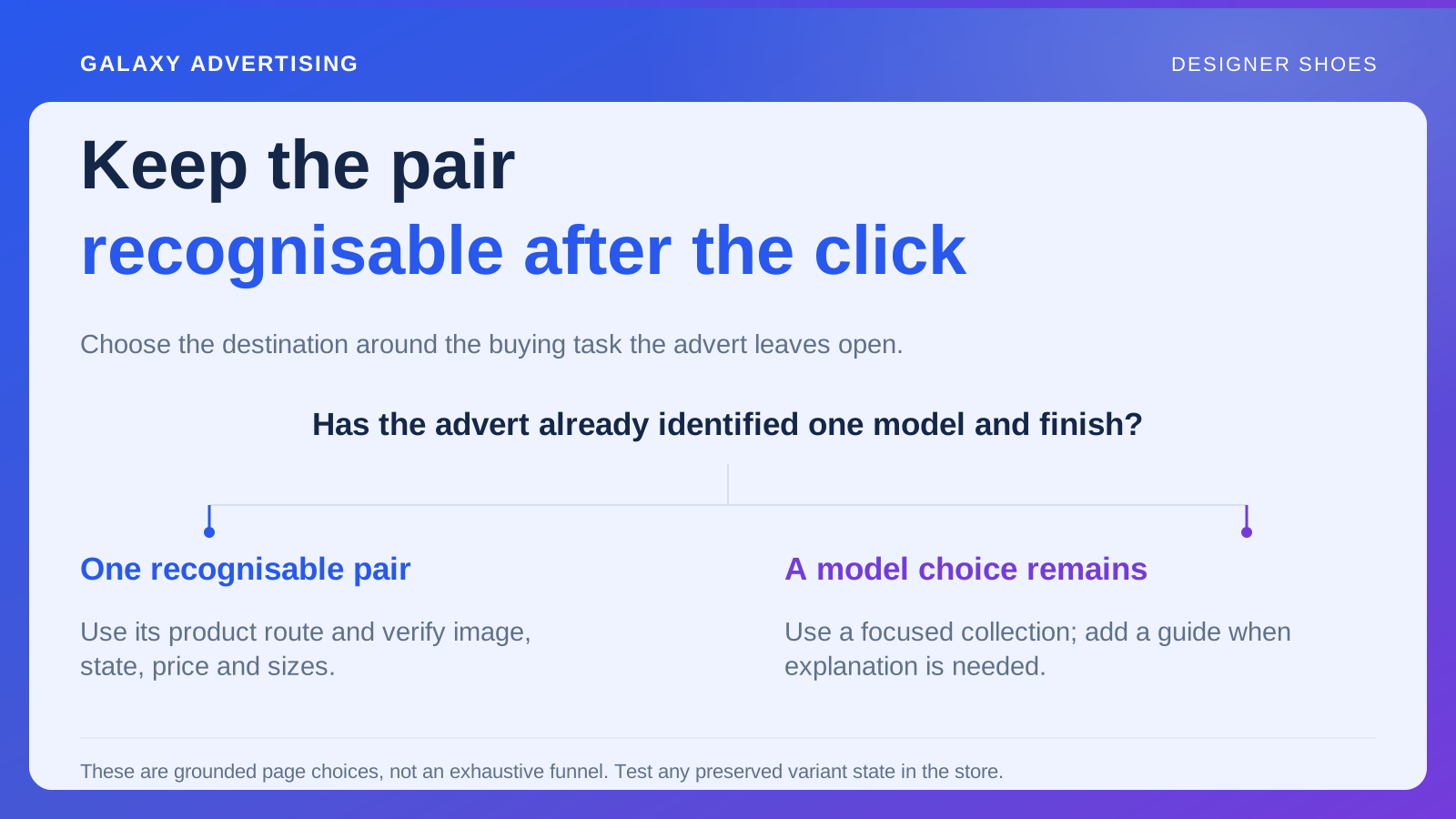
Link each model to its correct current destination. Retain finish identification and a clear route to that model's own sizing guidance. Don't assume people remember every detail when they leave the comparison. The connection needs to remain intelligible in the next step.
Label links by the task: viewing a model, checking size guidance and exploring finishes are different actions. A row of identical generic buttons can obscure those choices. On a phone, check that table headings stay connected to values. Technical responsiveness isn't enough if readers lose track of which pair an attribute describes.
Keep an item level reference list for future edits. A writer replacing a discontinued image needs its model, finish and version. Otherwise, a coherent looking chart can retain visual evidence of another item. The distinction needs to survive normal range updates and changes of page owner. That's a maintenance responsibility as well as a writing task.
Keep the explanation current
Assign review ownership for price, version and stock changes. A comparison can become inaccurate while neither underlying product page appears obviously broken. Review the relationship between the offers as well as the individual pages.
Use recurring questions to improve the explanation. If readers still confuse models, inspect the relevant label or image before adding promotional language. Correct the ambiguity you've found, rather than asking more persuasion to carry the same unresolved problem.
The useful comparison gives someone accurate differences, fair context and a clear way to investigate each pair. It supports their choice. It doesn't need every product to become the same exceptional answer, or pretend to make the personal decision for them.