A brighter purchase button won't resolve mixed size conventions. It won't reveal hidden model guidance or explain why options become unavailable only after selection either. Useful traffic and few orders can prompt a decorative fix while those practical obstacles remain untouched.
Follow the decision the shopper is trying to make. Separate demonstrated faults from missing information, commercial limitations and ideas about presentation that still need testing. That gives your team a specific brief, rather than an instruction to make the page convert better without agreeing what is wrong.
Describe the route you're concerned about
Identify the model, finish, entry point and device context. Check how product visits, selections and orders are recorded before interpreting the apparent drop. A change in measurement definitions can look like changed behaviour. Establish what the observation means before deciding what caused it.
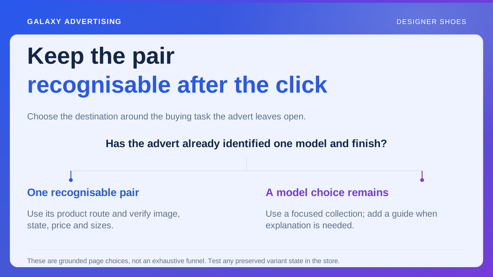
Use the actual campaign route where possible. Someone arriving from a demonstration of a particular model starts in a different place from a visitor browsing the whole collection. An aggregate page figure can hide that difference and encourage an explanation that doesn't fit the affected journey.
State the limits of the evidence. An incomplete selection doesn't reveal the individual's motive. It can justify investigation without proving everyone leaves for the same reason, or that your proposed redesign would solve it. Keep the observed problem separate from the explanation you want to examine.
Reproduce the ordinary selection steps
On a phone, choose an available size and inspect the image, label, price and basket reference. Make ordinary changes and check whether model identity and size convention remain clear. The review needs to follow use of the selector, rather than only inspect its starting appearance.
Record exact steps for reproducible faults. A size changing unexpectedly or another item entering the basket is a different finding from a label that could be overlooked. One requires a correction to demonstrated behaviour; the other needs a presentation hypothesis you can assess.
Where the component is shared, inspect neighbouring variants too. A variant is the selected size, colour or configuration. Fixing one option can affect another finish or model. Give the implementation owner enough context to reproduce the behaviour without depending on a long chain of screenshots and assumptions.
Check which guidance applies and where it lives
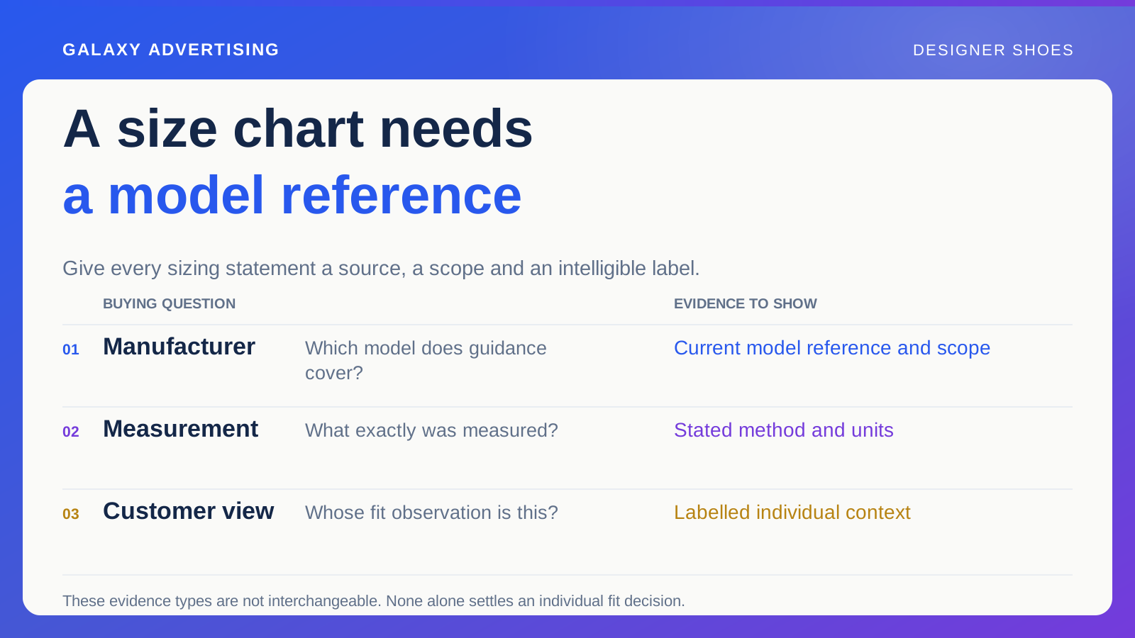
Identify the sizing information shown and whether it concerns the actual model. Distinguish manufacturer references, generic conventions and individual observations. Resolve conflicts at their source rather than put another reassuring sentence over the top. More confidence in the copy doesn't settle contradictory evidence.
Can someone reach the right reference while choosing? A guide buried in unrelated help content can exist technically while remaining impractical at the decision point. Check the route to it, not simply whether the website contains a sizing answer somewhere.
Avoid unsupported certainty. “This pair will fit perfectly” doesn't repair an unclear reference. Make the available evidence understandable while respecting what you can establish about a particular person. Helping the shopper assess fit doesn't require pretending you can settle it for them.
Recognise when the offer is the limitation
Before investing more in the page, inspect the useful size range. A model can be generally available while the audience you're promoting it to finds little purchasable choice. A button won't change that operating condition, however visible it becomes.
Show unavailable sizes honestly and review the alternatives. Another similar model needs its own explanation and reliable fit information. Don't imply the original selection decision transfers automatically. The alternative has to be something the shopper can assess on its own facts.
Treat interest in missing sizes carefully. It can prompt merchandising questions, but it doesn't establish how many orders you would certainly have received. Keep observed requests separate from speculative lost revenue. The interest is useful evidence without turning it into a guaranteed sale.
Follow the conditions appearing after selection
Inspect relevant delivery, payment and stated return or exchange information. Identify material conditions revealed only after effort has gone into choosing model and size. That timing can be worth changing, but first establish exactly what the customer could know and when.
Distinguish unclear conditions from an accurate offer someone declines. You might change a service, explain it earlier or accept its effect on some purchases. Those are commercial choices, not automatically usability defects. A well understood offer can still be unattractive to an individual shopper.
Check that customer service describes the same process as the page. Informal reassurance can create an expectation beyond approved purchase conditions. Give the audit one reliable operational source, so the correction doesn't leave different parts of the business making different promises.
Give each finding its own kind of action
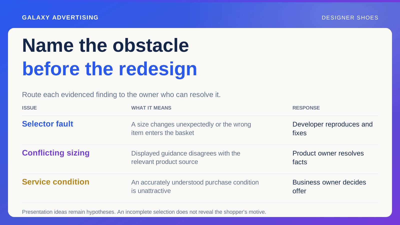
Separate verified faults, inconsistent facts, commercial constraints and testable presentation ideas. Name the appropriate owner and the evidence for completion or review. These findings shouldn't become an undifferentiated redesign request simply because they were discovered on the same page.
A developer can fix reproducible selector behaviour. A product owner can resolve conflicting sizing sources. A business owner may decide whether service conditions should change. Keep those responsibilities clear and sequence the work sensibly. Correct an inaccurate size label before testing a new purchase message, so the experiment doesn't mask the original ambiguity.
Verify completed corrections through the original entry point, not an internal shortcut to the page. A campaign link can preserve another state or introduce a different route. Save that link and the steps with the finding, letting later reviewers repeat the whole customer sequence after releases change shared behaviour. Checking the component alone can miss what remains unclear along the route.
Verify the change before interpreting the result
Repeat the same steps after implementation, including relevant neighbouring variants. Confirm what the customer sees and keep the release or version reference. A completed task needs to reach the intended route before it's a verified correction.
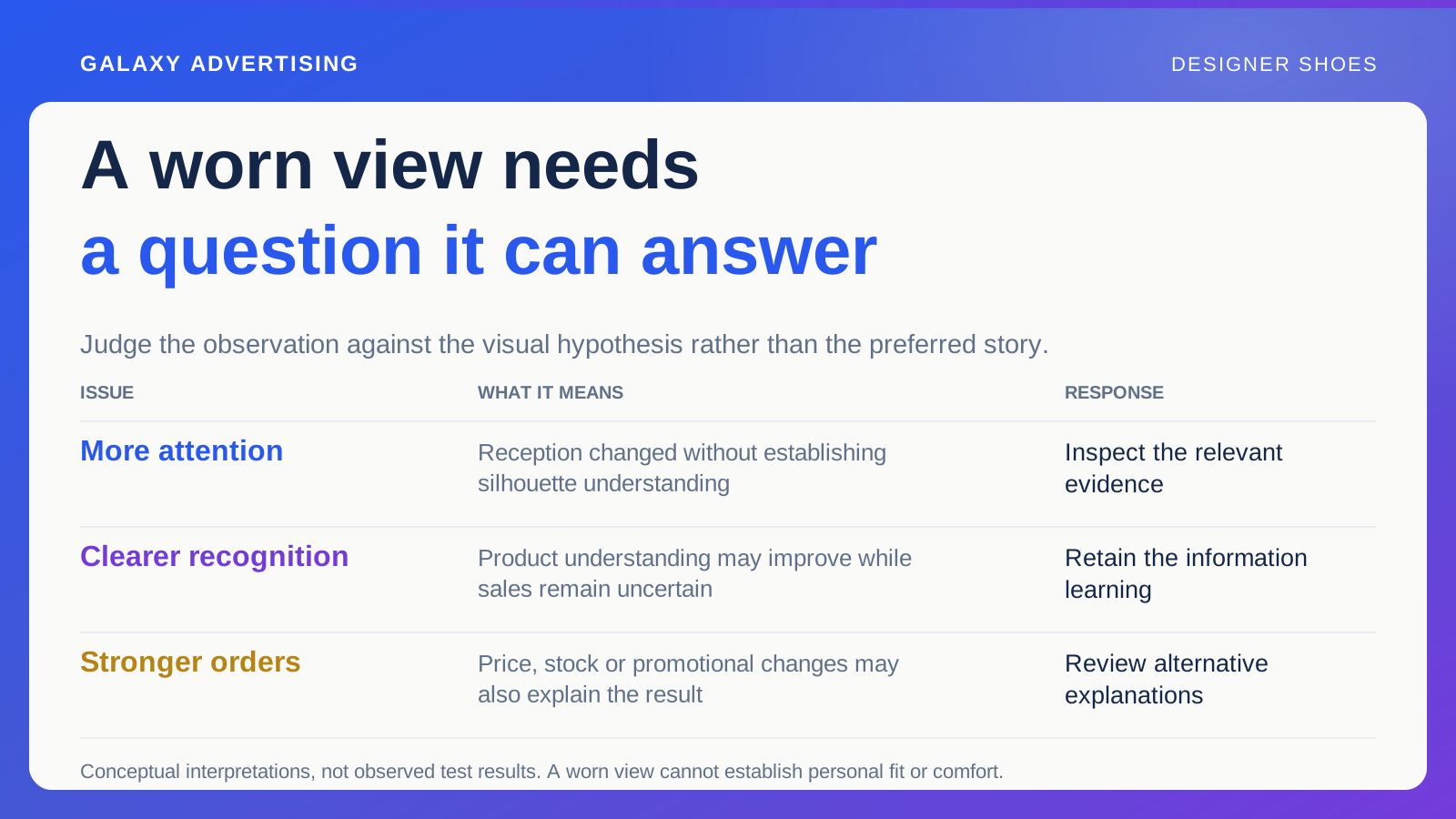
Then review commercial observations with traffic, stock and promotional context. Improvement after a correction is useful, but a simple sequence doesn't necessarily establish its precise causal effect. Match the conclusion to the comparison available.
The useful outcome might be a small factual fix, better access to information or a broader offer decision. A more prominent button can still deserve consideration. It earns a clearer place in the work when it follows a diagnosis of the selection obstacle.