What if both lip products in your range are “essential”, but your shopper can’t tell which one to put in the basket? Similar colours and equally enthusiastic descriptions can leave the actual difference unexplained. Calling both indispensable doesn’t help someone choose.
A useful comparison makes the alternatives understandable. It explains documented distinctions and leaves personal preference personal. Your job is not to announce a universal winner. Give the shopper a fair basis for choosing, recognising a limitation or deciding they need more information before going further.
Compare the alternatives people really consider
Look at product enquiries, internal searches and conversations about substitutions. Find occasions where people genuinely compare two products or formats. Similar packaging alone does not mean those items answer the same buying question. Start with the decision, rather than the visual resemblance.
Keep the comparison manageable and give it an explicit purpose. You could explain finishes in one range, or compare package sizes for someone who already knows the product. Combining unrelated decisions can produce a chart that looks comprehensive but remains difficult to use.
Write down what it cannot establish as well. Describing appearance does not predict an individual experience; comparing quantity does not determine personal suitability. Those boundaries help the writer provide useful retail information without making a stronger recommendation than the evidence supports.
Keep facts and preferences in different places
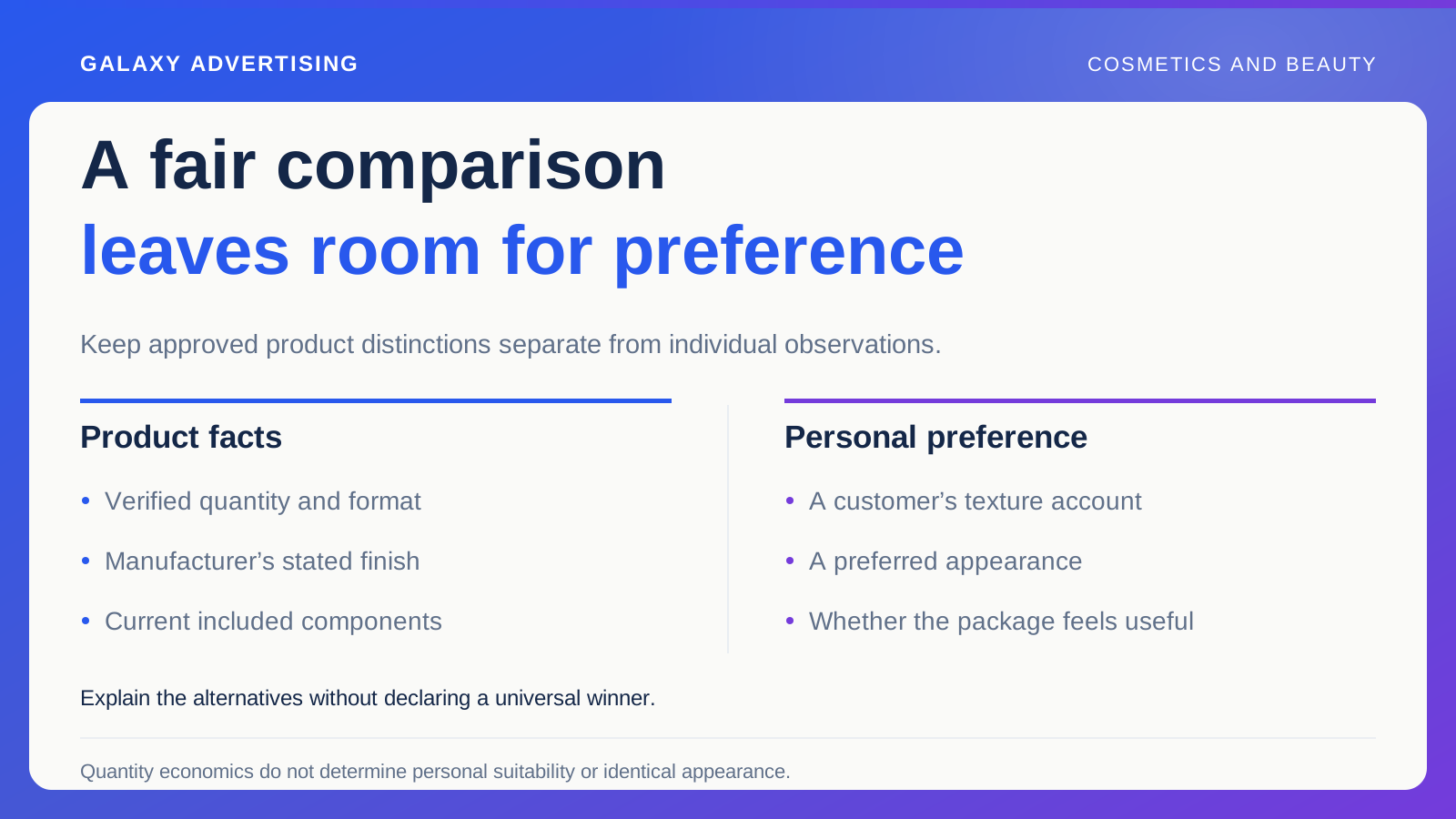
Build a factual column from approved information. It may include quantity, format, available shades, the manufacturer’s stated finish and included components. Verify every entry against the current offer. An earlier campaign is not automatically a reliable source for today’s comparison.
Keep preference language distinct. A customer calling a texture pleasant is describing their own observation. That is not a measurement proving another product inferior. If you use customer comments, preserve their context and make their nature clear.
Check again when shortening the comparison for advertising. A qualified paragraph can become an unsupported absolute in a headline. Review the compact version independently. It still needs to say only what the underlying information can actually support, even when space is tight.
Give the images a fair basis too
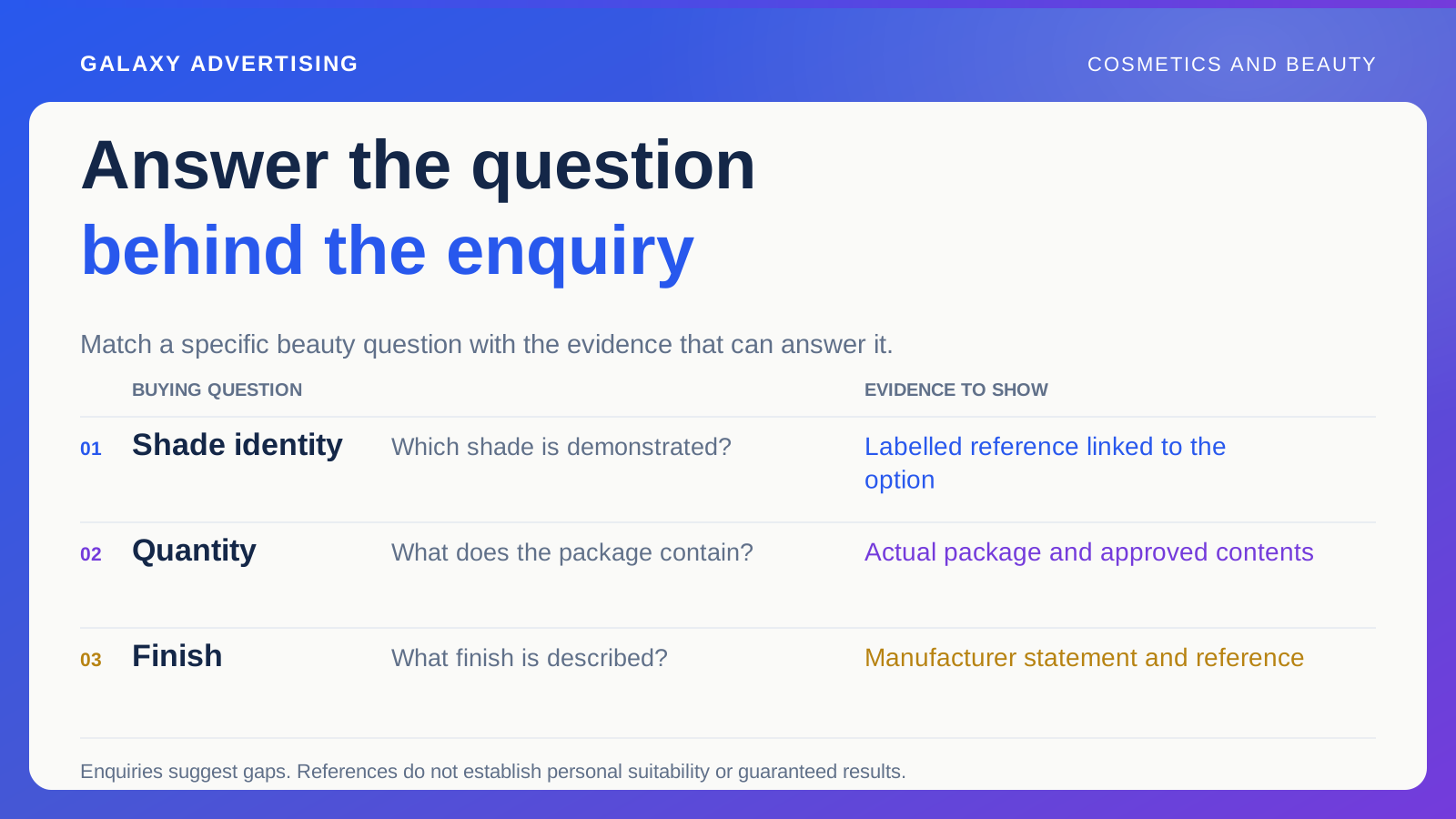
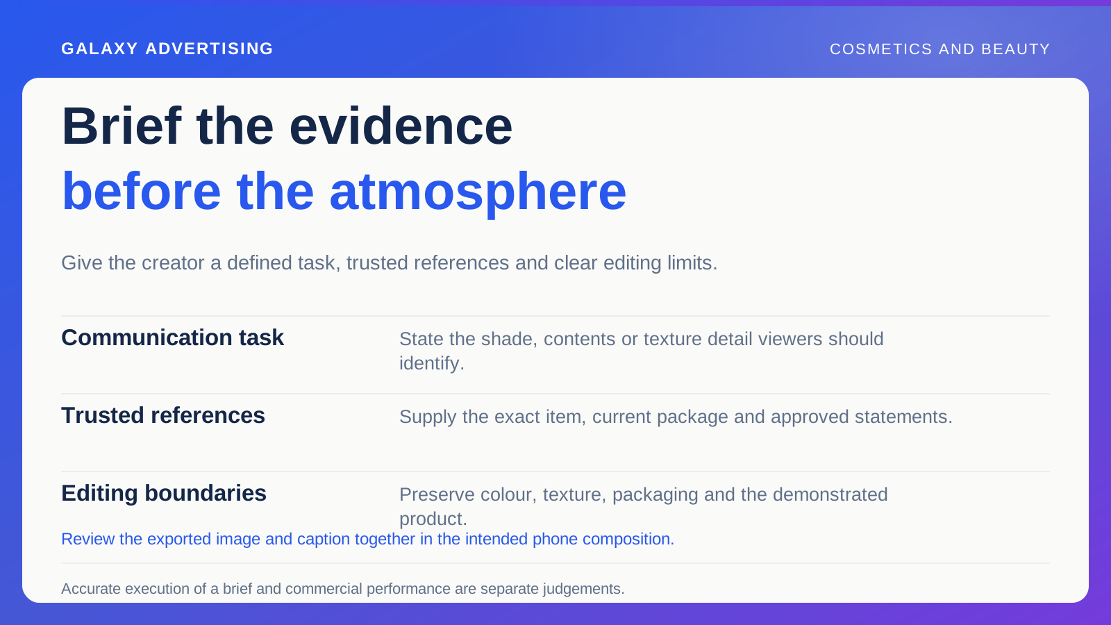
For shade or finish comparisons, specify consistent viewing and production conditions. Different lighting or editing should not become the apparent product advantage. Keep approved image references alongside the chart so future changes have something reliable to check against.
Label the exact item and variant, the selected shade or configuration. Where it affects interpretation, say when an image is illustrative. A generated application result should not be presented as evidence of the supplied product’s behaviour. Its visual polish doesn’t settle that question.
You can acknowledge what a screen cannot establish and still help people compare. A displayed colour will not necessarily look identical in every setting. The objective is a clearer choice, not an artificial promise of certainty about individual appearance.
Compare what can actually be purchased
Make sure each price refers to the stated quantity and configuration. A lower package price may buy less product, while a bundle may contain things the shopper doesn’t need. Neither automatically offers better value for that person.
If a unit comparison helps, state its basis and verify the calculation. In a hypothetical example, a 20 ml product costing £20 has a different price per millilitre from a 40 ml product costing £32. That arithmetic describes quantity economics. It does not make the larger purchase the right personal choice.
Include material conditions, such as an optional accessory shown in an image. A tidy chart can produce an apparently neat conclusion by ignoring the fact that its packages aren’t equivalent. Keep those distinctions visible, even if they make the table less simple.
Let each option have an honest role
Explain the decision each product may serve without promising an unsupported personal outcome. One format may be easier to understand for someone already familiar with that presentation. Another may provide a different documented finish or package size. State the difference you can support.
Don’t manufacture a weak alternative so your preferred item can beat it. If you cannot explain a useful difference, reconsider whether you need a comparison page. Clearer individual product information might do the job better. A comparison needs a real reason to exist.
Keep subjective wording balanced. A shopper who likes another finish has not misunderstood the offer. Your aim is a better match between the product and their priorities, not a route that always ends at the highest priced item. Leave room for a reasonable different preference.
Put the guide where the question arises
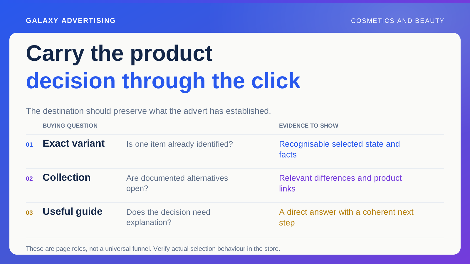
Link from the relevant product pages and label the route with the decision it answers. An invitation to compare available formats is more useful than a vague “learn more”. People should know why that link is worth following.
Let them return to the item they were considering. Preserve its identity and selected option, then inspect the journey on a phone. A helpful guide loses much of its value if the customer has to restart the search once they’ve read it.
Keep availability current. A temporary shortage is different from an underlying product distinction. If you offer a substitute, describe it on its own merits. Quietly treating it as an identical replacement can undo the clarity the guide was meant to create.
Check whether the real ambiguity has eased
Ask customer service whether the same basic distinction still prompts repeated questions. Inspect available evidence of exploration and selection. Keep its limits in view: a page visit does not reveal somebody’s whole decision or establish why they chose as they did.
Look for new confusion as well as apparent improvements. A shorter label can make a range easier to scan while hiding a qualification people still need. Useful editing keeps the complexity that matters. It doesn’t remove every distinction just to simplify the page.
A comparison with clear facts and boundaries gives you a maintainable explanation for advertising, customer responses and navigation. Its value is in the choice it makes understandable. The strongest result is a customer who can inspect the differences and decide, even when your preferred product doesn’t win every row.