Your shopper adds a foundation to the basket, then discovers that the selected shade isn't the one they expected. In the office, the conversation is already moving towards a checkout redesign or a bigger discount. Neither addresses that mismatch.
Those changes may be premature. Start by following the actual product decision and separating faults you can demonstrate from unclear information, commercial choices and ideas that still need testing. An incomplete basket is an observation, not a diagnosis. The useful question is where the offer stopped making sense.
Be precise about what changed
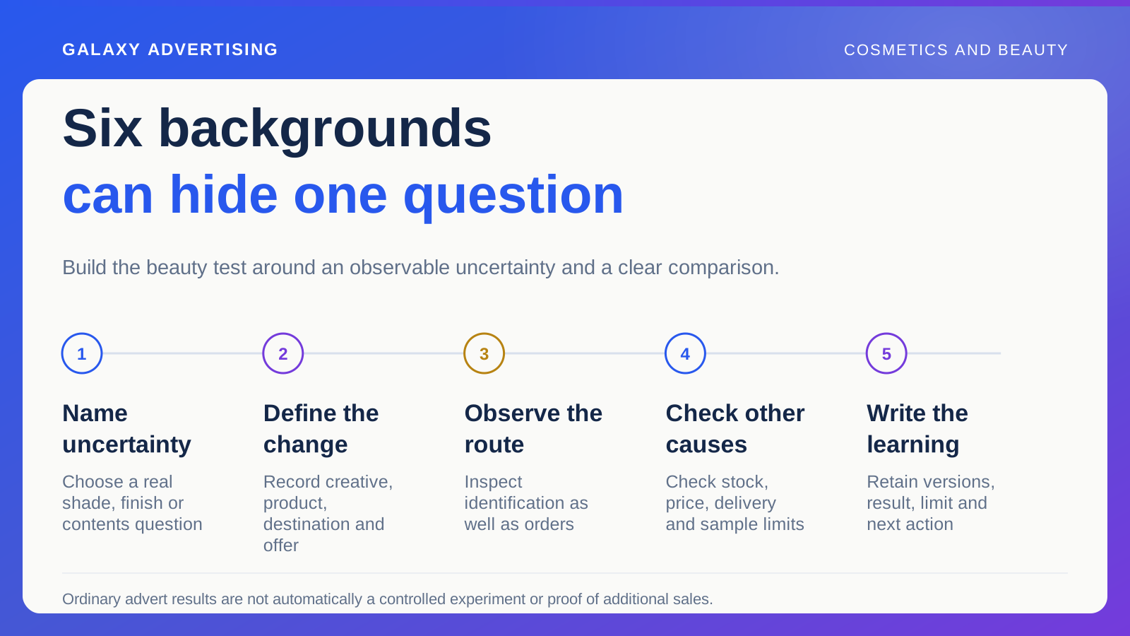
Identify the product, device route and period involved. Check how your business records an addition to basket and a completed order. Changed event definitions or implementation can make a reporting difference look like changed customer behaviour. Establish what the numbers describe before interpreting them.
Use an appropriate reference for the affected route and keep its limits visible. A promotion featuring one shade may bring a different customer mix from ordinary traffic. An overall website rate can hide that difference and send the investigation towards the wrong explanation.
Don't assign a motive to every person who leaves a basket. The observation warrants investigation without proving why each individual stopped. State what you know first. Then suggest an explanation you can examine, rather than making the explanation sound like something already established.
Follow the shade all the way through
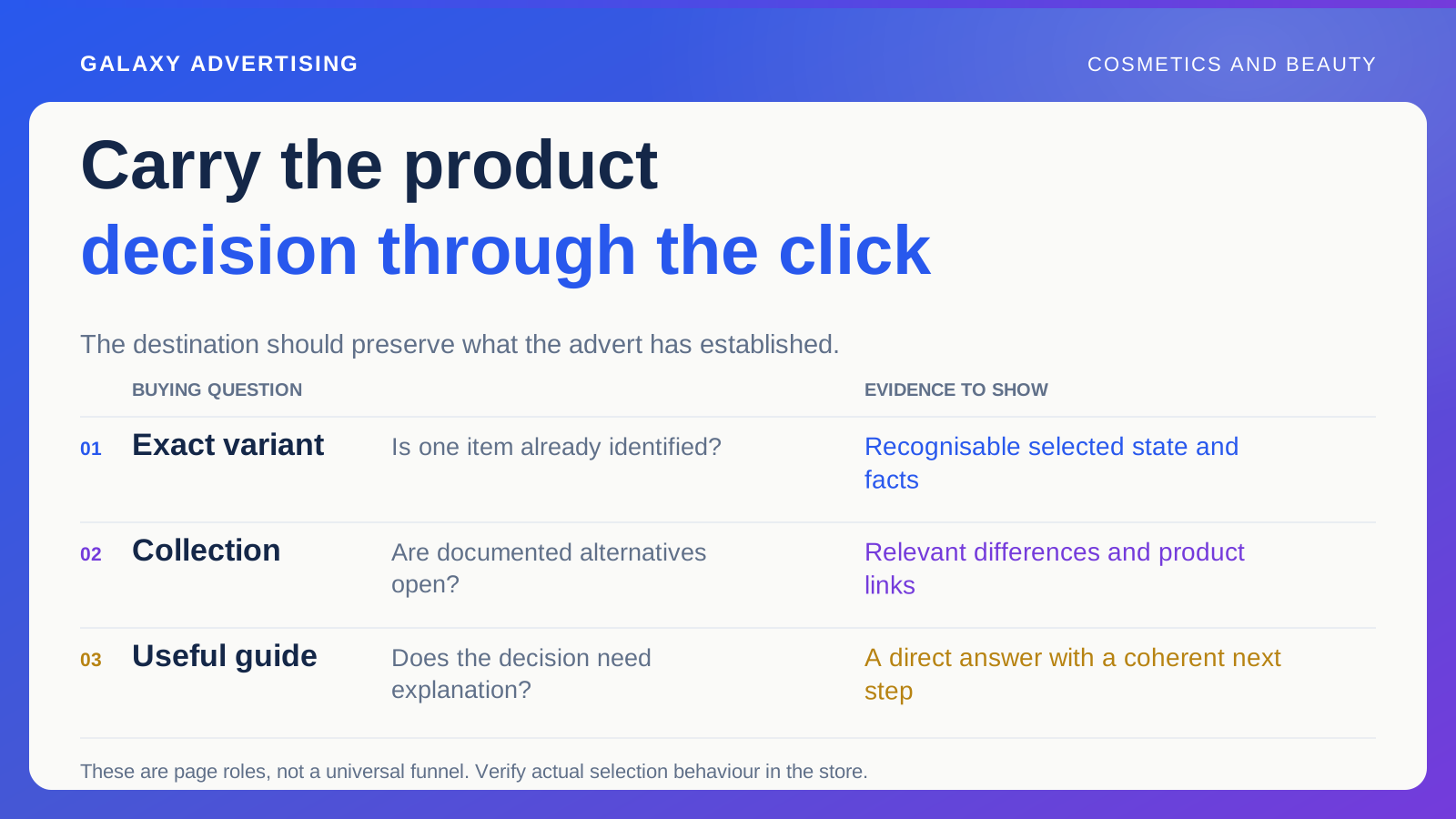
Start with a current advert or relevant entry page. Select the demonstrated product and follow its variant, meaning the chosen shade or configuration, through the image, label, price and basket entry. Does that selected state stay clear after ordinary interactions?
Do this on a phone as well as your usual working screen. A control can function technically while making the selection unclear in a narrow layout. Record the precise state and action that cause the issue so another person can inspect it too.
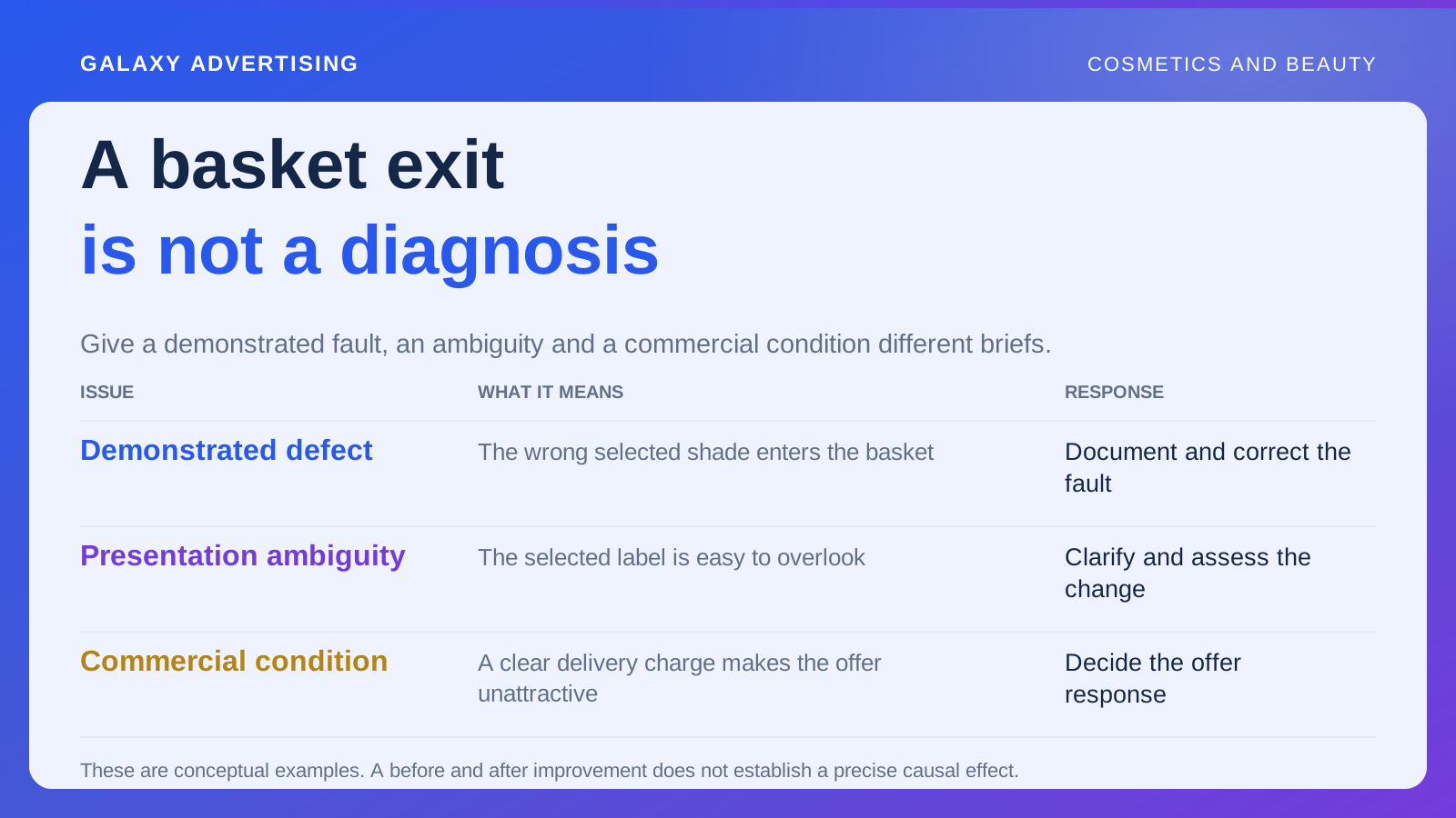
Separate a fault from an unfamiliar design choice. The wrong variant entering the basket is reproducible. A selected label that's easy to overlook needs a clearer presentation hypothesis and a way to assess it. Those findings deserve different briefs, even if they initially feel like the same problem.
Check the package the shopper thinks they're buying
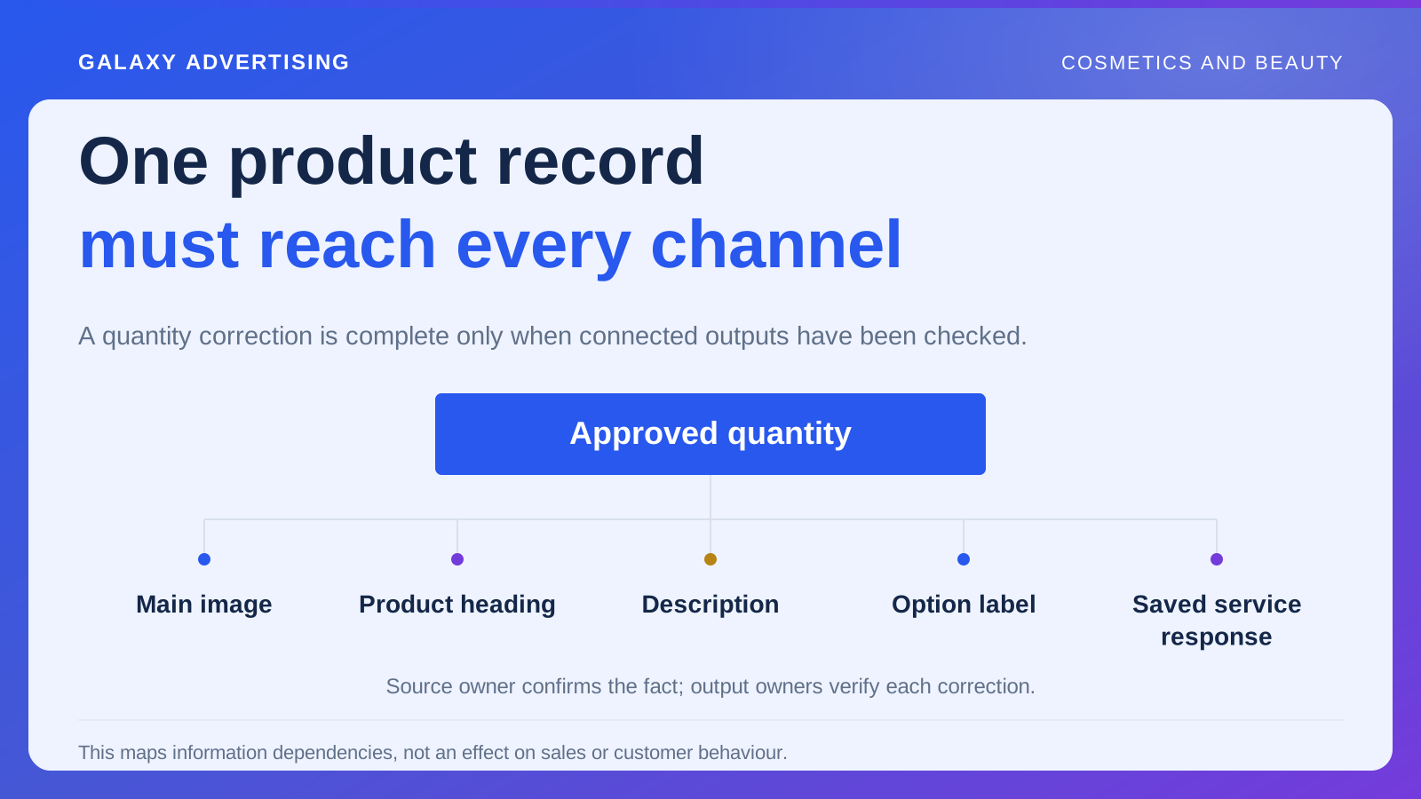
Compare product imagery with the basket description. Verify quantities, included components and promotional additions. A miniature, refill or alternative package needs to remain identifiable rather than borrowing the appearance of another item. The picture and the order should describe the same purchase.
Ask customer service about recurring misunderstandings. Those conversations can expose worthwhile questions, but a handful of examples won't explain every abandoned basket. Use them to direct the investigation without stretching them into a complete account of customer behaviour.
Look at styling images and optional extras. If the main picture implies more than the order contains, the contradiction begins before checkout. Changing the payment layout can't repair an expectation created earlier. Find where the misunderstanding starts before deciding where the correction belongs.
Find the condition that arrives too late
Follow delivery information, relevant charges and stated purchase conditions. What can the shopper reasonably know before adding the product? What appears only afterwards? Make the gap explicit rather than simply saying that checkout feels difficult.
A newly revealed cost is both a commercial fact and a presentation issue. You might change the service, explain it earlier or accept its effect on some purchases. Discuss those as different responses. They involve different decisions about the offer, not just different wording.
An unwelcome condition isn't automatically a usability fault. Someone can understand the offer accurately and decide it isn't worthwhile. Good design should help them make an intelligible decision, rather than hide a condition until they feel too committed to reconsider. Customer understanding is the job here.
Make reassurance answer the actual question
Review the product and purchase information available where someone selects the item. Is approved factual guidance easy to find? Or are broad statements filling space where the shopper needs a specific answer about this product or transaction?
Don't improvise personal suitability advice to remove hesitation. Improve access to verified information while recognising what you can responsibly establish for an individual. The fact that a shopper wants reassurance doesn't give the retailer evidence it doesn't have.
Apply that discipline to quotations and other supporting evidence. A general compliment about packaging won't answer uncertainty about the demonstrated shade. More reassurance isn't necessarily more relevant reassurance. Check whether it addresses the obstacle you've actually found.
Give different findings different actions
Separate demonstrated defects for correction, presentation ambiguities for clarification and commercial constraints for a business decision. Keep unproven explanations as hypotheses. That prevents every observation in the review being promoted into an established conversion problem.
For a fault, provide the item reference, reproduction steps and expected behaviour. For a hypothesis, describe the proposed change and the observation that would support or challenge it. Give each to the appropriate owner. “Improve confidence” isn't a useful development instruction on its own.
Choose a manageable sequence. Correct an inaccurate basket reference before testing a new incentive, so the promotion doesn't mask the original problem. That order makes later conclusions easier to interpret and gives each change a clearer purpose.
Keep changing one's mind separate from encountering preventable ambiguity. Someone can identify a refill correctly, see its price and decide against it. Discovering only in the basket that the pictured outer case isn't included is different. Document that second problem precisely without calling the first decision a design failure. You can't remove every reason not to purchase, and that shouldn't be the corrective brief.
Verify the fix before claiming a sales effect
Repeat the same route after the change. Confirm the intended issue is resolved, inspect neighbouring variants that share the behaviour and retain the version or release reference. A completed task isn't quite the same as a verified customer route.
Then review commercial observations consistently, including relevant changes in traffic, stock and price. An improved purchase rate after the correction is useful evidence. Its interpretation depends on the comparison available; a simple before and after sequence doesn't establish a precise causal effect.
You might finish with a small label correction, earlier service information or a broader offer decision. The value is having a brief grounded in an evidenced obstacle. A more attractive checkout can't rescue a diagnosis you haven't established.