It’s easy to reach for a discount when the real hesitation is choosing a shade. A shopper likes your tinted moisturiser advert, but cannot tell which shade they’re looking at. On the product page, small swatches and a promise of a natural finish leave the same question hanging.
They understand the offer ends soon. They still don’t understand the product choice. For a purchase where shade matters, making that choice clearer can be more useful than adding another incentive. That means helping people compare, while being honest that a photograph, description or recommendation cannot guarantee an individual result.
Start with the difference they need to understand
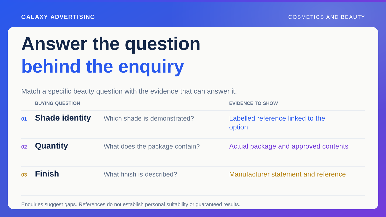
Your shopper might be checking shade, texture, finish, quantity or how an item fits into an existing routine. Those are different questions. Rolling them into “works for everyone” makes the message broader and the answer less useful.
Read real product enquiries and questions about variants, the selected shade, size or configuration. Establish which distinctions your range actually supports and how the manufacturer describes them. Don’t invent a suitability system just because it would look good in a graphic.
If the brand provides a shade comparison method, explain its limits and connect it to the actual options. A familiar shade name or an attractive colour patch may still leave somebody unable to make a confident comparison. Find out what information is missing before decorating the answer.
Keep the shade in view all the way through
When an advert shows a particular shade, label it clearly and give people a useful route to that option. When several shades appear, make the changes between them understandable. The viewer shouldn’t need the production brief to follow along.
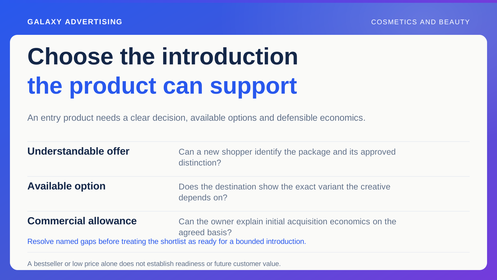
Then click through. Does the destination display the intended item? If the demonstrated shade is unavailable, the practical offer has changed. Quietly opening a different default can make the product feel inconsistent, even if that alternative is available.
Don’t expect someone to remember an exact shade name from a short asset. Help them reconnect what they watched with the option they were considering. Recognition needs to survive the journey from advert to page.
Make your images a fair comparison
Use a consistent approach when photographs compare shades or textures. Otherwise, lighting and editing can become the biggest apparent difference between the products. Keep approved references and check exported assets against them.
Treat retouching and generated imagery carefully. A polished visual can accidentally change colour, texture or the appearance of coverage. If you’re asking an image to demonstrate product behaviour, verify what it represents. Looking better is not the same as being more accurate.
Explain in the caption when an image is illustrative. A reference can help somebody decide without suggesting they’ll see the same appearance in every condition. You can be useful without promising certainty you don’t have.
Put the facts where people can find them
Make ingredients, quantity, directions and relevant manufacturer guidance accessible. Stick with approved claims. A customer’s preference doesn’t give the business evidence for a broader promise.
Your marketing team also needs to know who owns product accuracy. Who can resolve a question about an ingredient statement or an asserted benefit? A deadline won’t make an improvised claim any better supported.
Separate useful information from more promotional copy. Someone comparing options may need one clear attribute or a reference image. Another paragraph calling the range luxurious, effortless and transformative won’t necessarily help them choose. Give the decision some room to breathe.
Give each creative concept one job
One concept could show texture during application. Another could explain the available finishes. A third could clarify quantity and packaging. Each helps the customer assess something different.
Keep that main argument visible in the brief. If every concept repeats the same broad promise against a different background, you’ve created visual variety. You haven’t necessarily learnt anything new about the uncertainty holding the buyer back.
Use people and customer material with appropriate permission, and verify the claims alongside it. A genuine testimonial remains an individual account. It doesn’t automatically substantiate every benefit you might want to attach to the product.
Look at the shades behind the result
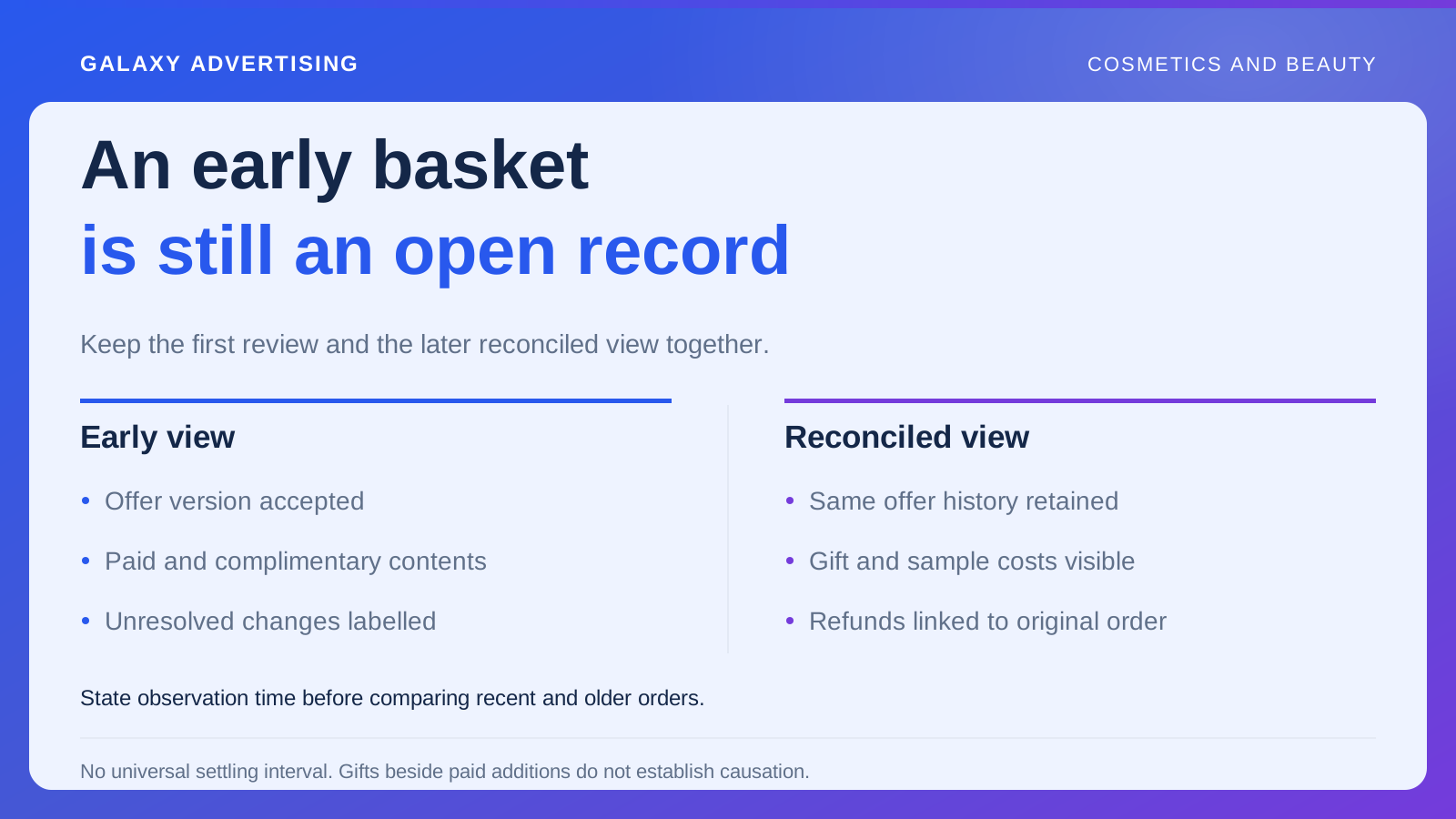
An overall result can hide a shortage in the shades customers want. Look at the connection between promoted variants, visits, orders and selection questions. An availability issue deserves to be visible before it becomes a vague complaint about campaign performance.
Review the resulting order costs using your own definition of contribution, the money remaining after the costs included in your calculation. A discount may increase purchases while leaving less contribution and the original confusion untouched.
Keep the limits of your evidence in view. A small collection of returns or enquiries cannot explain every nonbuyer. Use it to frame a correction or a test, then inspect what changes when you improve the relevant information.
Follow one shade yourself
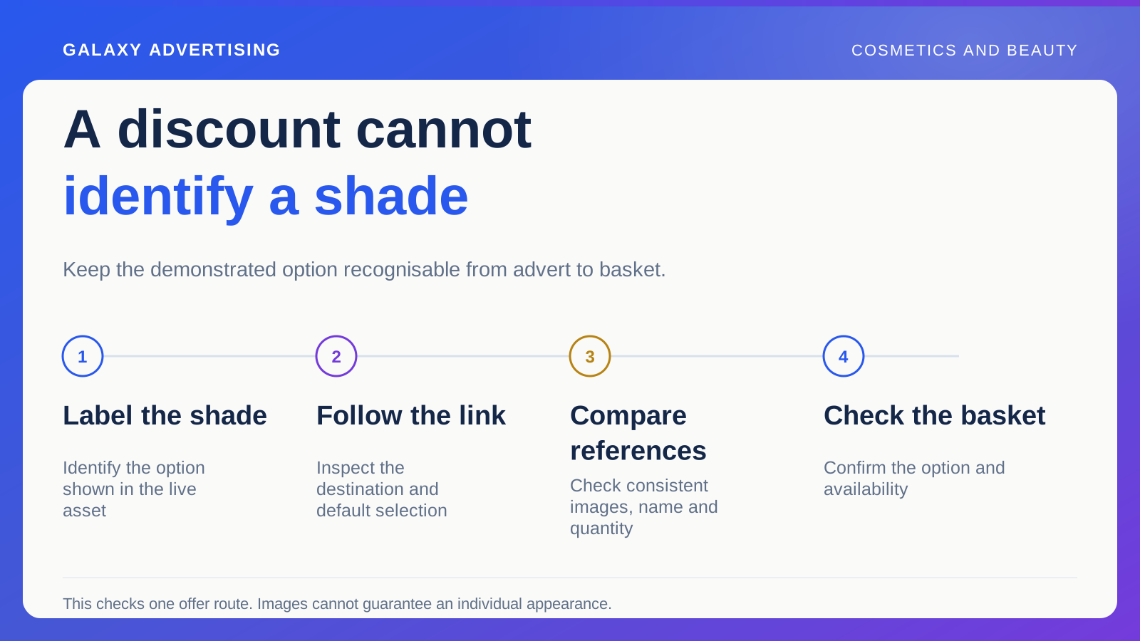
Pick a live asset and identify its demonstrated shade without asking anyone to remember the brief. Follow the link, inspect the default selection and compare the visible reference images. Check the name, quantity and availability before continuing to the basket.
If the shopper has to select the shade again, is that step understandable? This narrow exercise can reveal a mismatch a general website review misses. Give the fix to whoever owns the relevant link, data or page control, then verify it under the same viewing conditions.
Keep the approved asset reference so a later edit doesn’t quietly bring back inconsistent colour. This check establishes whether one communicated offer remains identifiable. It cannot settle broader questions about the whole shade range; those need their own product and customer information review.
Let clarity do some of the work
A useful first improvement might be a labelled route from the demonstrated shade to consistent comparison images, then clearly organised product facts. Try it on a phone. Small swatches and hidden labels can be particularly hard to interpret there.
Keep the commercial conditions visible, but don’t ask urgency to explain the product. If someone cannot recognise the item relevant to their decision, an expiring offer can increase pressure without increasing understanding.
A stronger beauty proposition lets people recognise the alternatives and inspect reliable information before choosing. An incentive can still play its part. Give it a product decision the customer can actually understand.