What if the most impressive electric bike in your comparison table leaves a buyer's storage question unanswered? The expensive model can look like the obvious recommendation because its entries appear stronger. The customer still doesn't know which differences matter to their journey or where they need further advice.
A useful comparison helps someone recognise requirements and understand tradeoffs. You don't have to rank the entire range from best to worst. Make verified differences understandable, and show where individual questions need more information. A larger number can't make the whole buying decision.
Give the comparison a manageable purpose
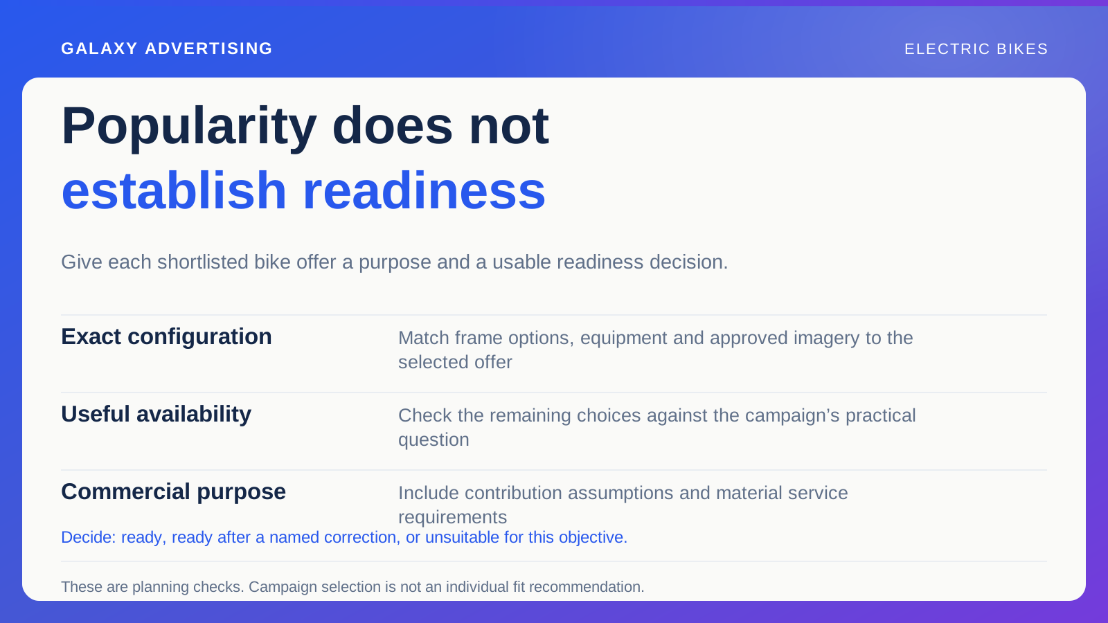
Decide what the page should help someone do. Perhaps it compares a small selection for an intended use, explains package differences or helps people identify questions to bring to an adviser. Each is a useful job with its own scope.
Don't collect unrelated models merely because they're in your catalogue. A comprehensive looking page can still do little to narrow a real decision. More entries won't necessarily make it easier to see the distinctions a buyer needs.
State the purpose near the beginning. A comparison focused on supplied equipment shouldn't imply a complete assessment of personal suitability. A clear boundary makes the content more useful: readers can tell whether it addresses their question, and recognise what the page hasn't set out to establish. That clarity gives the comparison a fair job to do.
Establish requirements before awarding points
Explain which facts shoppers need to establish about their circumstances and intended use. Keep guidance tied to appropriate documentation, and route individual assessments to suitably qualified assistance where needed. A general page still has limits.
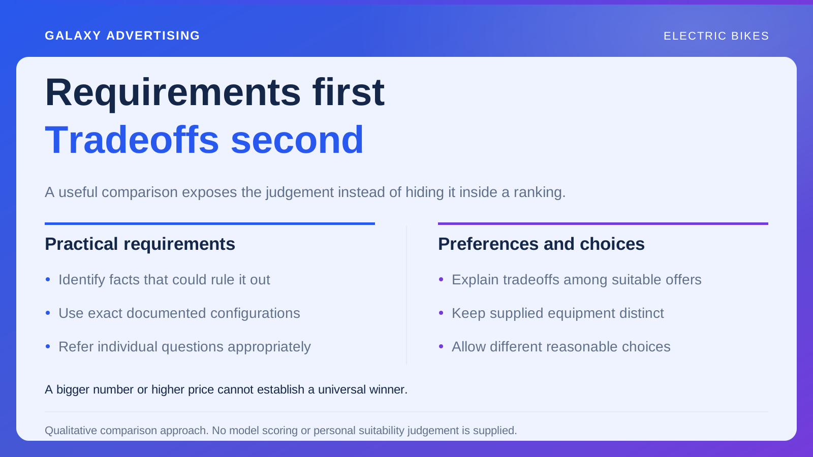
Separate requirements that might rule out an option from preferences among suitable offers. An attractive feature doesn't compensate for an unmet practical requirement elsewhere. Let customers understand the difference before asking them to weigh the appealing details.
Avoid an overall numerical score unless you have a defensible method and a clear reason it helps readers. Your own ranking can make complex tradeoffs appear objective while hiding the weighting choices that determine the result. Plain explanations can expose more of the judgement a buyer actually needs to understand. A score shouldn't conceal the decision it claims to simplify.
Compare the exact models and packages
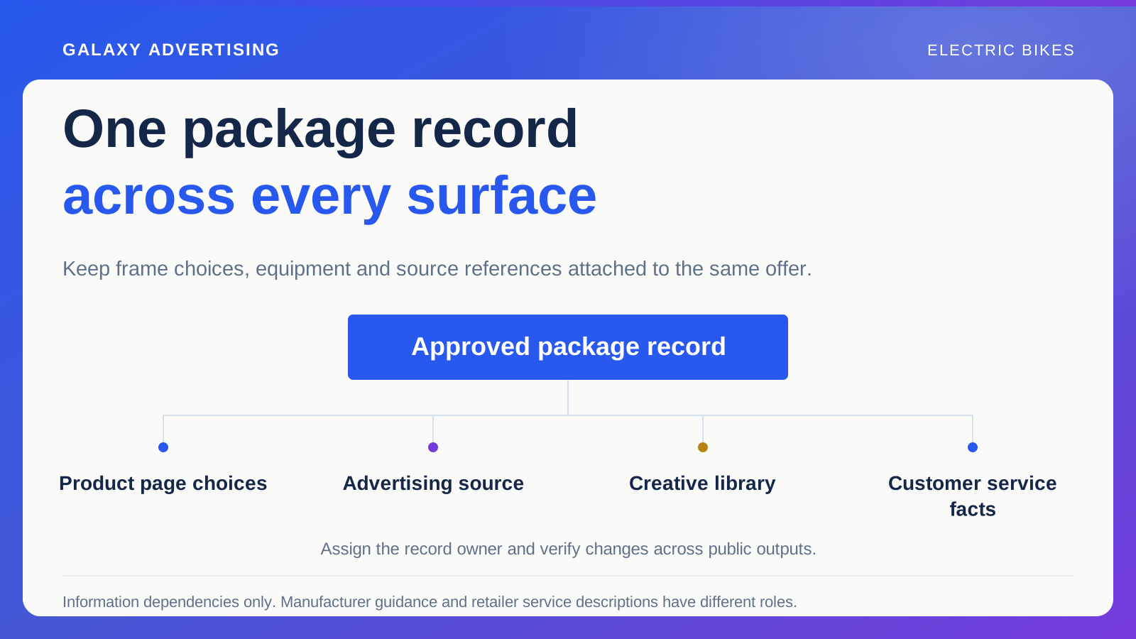
Identify every model and package precisely. Check the facts against relevant manufacturer references, keeping important conditions attached. Copying isolated figures into a simplified table can strip away information necessary to interpret them.
A public family name may cover several options. Show which configuration each statement concerns so somebody can find the corresponding offer. The comparison and the next product page need to describe an identifiable item.
Separate supplied equipment from optional additions. A photograph may make one bike look more complete because it includes styling accessories absent from the price. Use a consistent basis. Otherwise, the imagery and pricing can imply a difference the packages don't support, leaving the buyer comparing appearances rather than the actual offers.
Explain the practical meaning of a difference
Connect a fact with its possible decision consequence, without making an unconditional recommendation. A documented dimension can help someone assess restricted storage. They still need to measure and understand their own arrangement before deciding it works.
For a hypothetical comparison, one package might include a particular carrying arrangement while another has a simpler configuration. Explain what's supplied and which questions the buyer should consider. Don't assume every commuter values the same equipment or every leisure rider wants the same package.
Keep technical detail available to those who need it. Your explanation should translate why a fact matters, rather than remove the source information or replace it with a broad lifestyle label. You can make a difference easier to understand while allowing the reader to inspect it properly.
Allow a tradeoff to stay a tradeoff
A compact offer, another package or a different service arrangement can benefit one task and limit another. Acknowledge those relationships where the evidence supports them. The useful choice depends on what the customer needs to do.
Don't dismiss a cheaper model simply to defend a premium sale. If it meets someone's requirements, choosing it can be sensible. Equally, omitting a meaningful documented difference from a short table doesn't make the models equivalent. Both distortions make the comparison less useful.
This is an editorial decision as well as a sales one. Let readers see why different people could reasonably choose different offers. Forcing every route towards the current favourite hides the very judgement the page should help them make.
Check the mobile experience as a comparison. When columns become stacked sections, readers can lose which specification belongs to which bike. Repeat clear identifiers where necessary and preserve the explanation of relevance. The job is to keep the decision intelligible, rather than squeeze a desktop table onto a smaller screen.
Connect the explanation to an offer people can buy
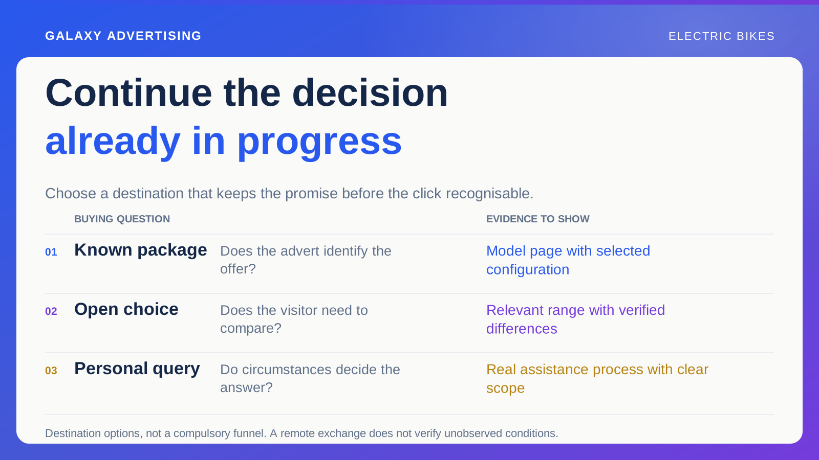
Link to the exact relevant offers and keep configuration labels consistent. Customers shouldn't have to identify the item all over again when they follow the comparison to investigate it further. Preserve the connection you've helped them establish.
Maintain price and availability checks. Feature information can stay accurate while the page becomes commercially confusing because the highlighted package is no longer available. Both the product facts and current offer need attention.
If a model changes or sells out, update its status and explain alternatives honestly. Don't transfer the old conclusions silently to a replacement because the imagery looks similar. Verify the new offer before it inherits a place in your comparison.
Notice which questions remain unresolved
Use relevant enquiries and customer observations to judge whether readers understand the differences. Repeated questions may expose a missing explanation, unclear label or requirement that needs a route to assistance. Let them inform a specific improvement.
More time on the page isn't automatic proof of better guidance. It can mean useful consideration or continuing confusion. Interpret it alongside the actual question and resulting decisions.
The comparison has done useful work when someone can see what differs, what they still need to establish and which identifiable offer to investigate. That's a stronger service than a definitive looking ranking that lets the easiest headline figure choose on their behalf.