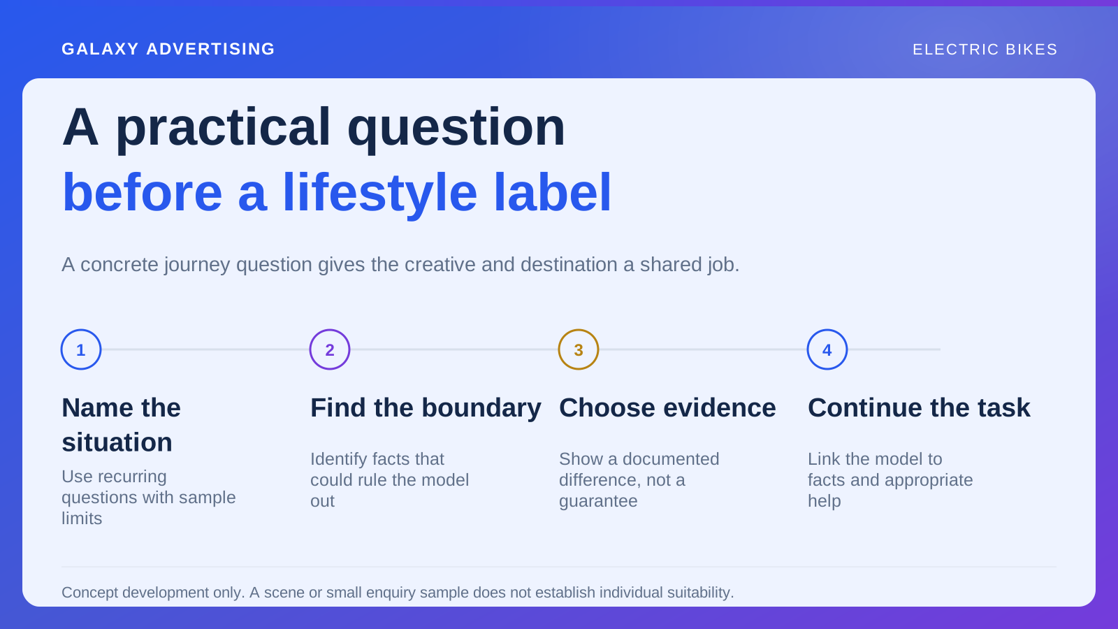
Why does an advert naming a particular electric bike open a general page about the category? Or why does an invitation to compare options drop the customer straight onto a single configuration? Both pages can look polished while helping with the wrong task.
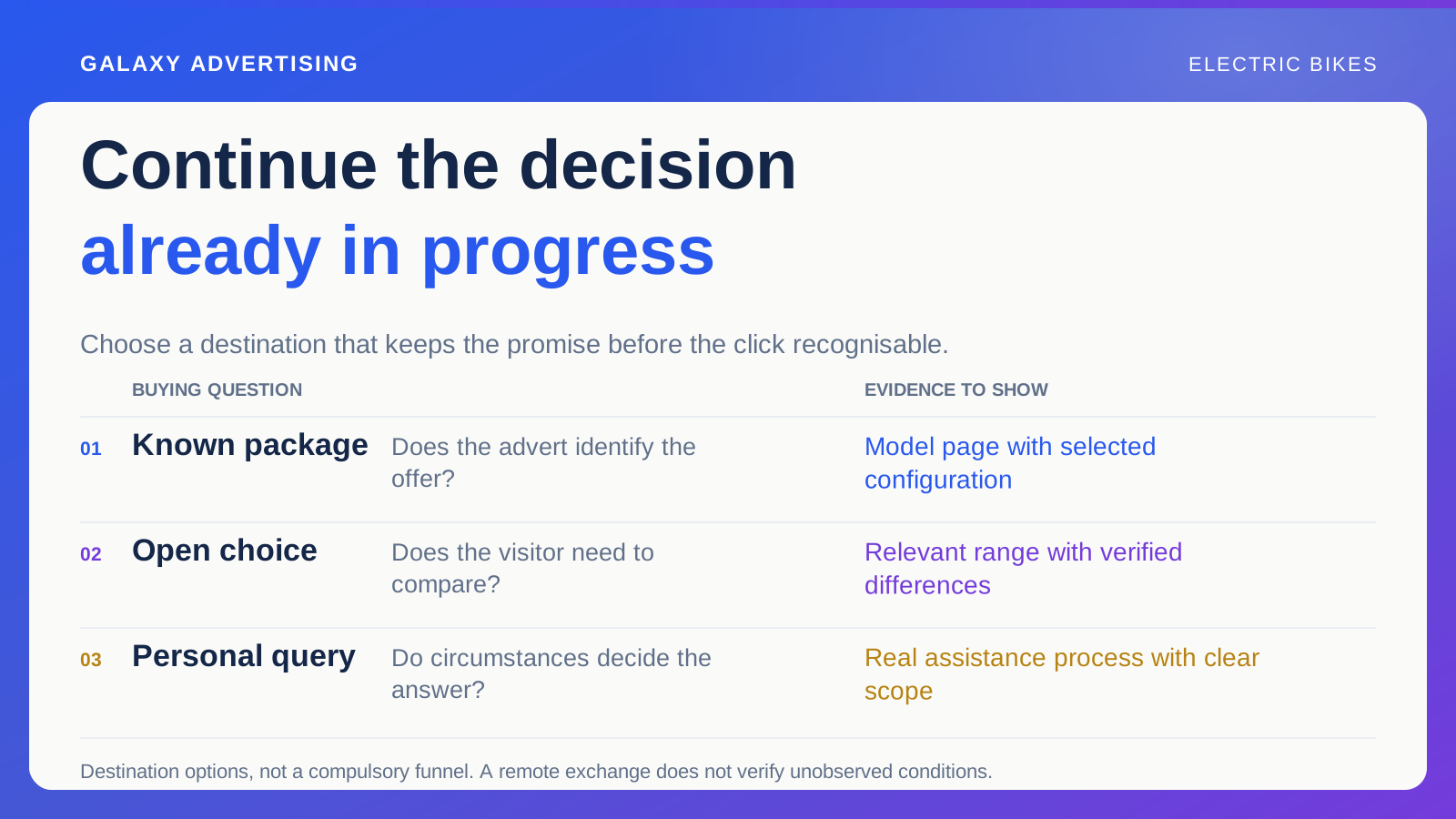
Plan from the promise before the click. Someone investigating a known model, choosing among alternatives or seeking an individual answer needs different support. Preserve what they've already established and make the next decision clear. They don't all need to order immediately for the destination to do useful work.
Put the entry promise beside the proposed page
Record the model or question shown, configuration described and action invited. That gives your team something practical to evaluate when choosing a destination. Design polish alone won't tell you whether a page continues the customer's task.
A clearly identified package should remain identifiable after the click. An invitation to compare still needs to offer a manageable choice. Keep the reason for the visit connected to what the page makes possible.
Reassess the pairing when creative changes materially. Similar footage can carry different arguments. A destination suitable for one version can confuse visitors arriving from another. Approval needs to cover the route people actually encounter, rather than a page reviewed separately from the communication introducing it. Make the relationship part of the choice, instead of treating the link as the last administrative detail.
Use the model page when the offer is known
Give a direct route when the item and package are identified. Follow the actual link and verify the selected option, images, price and availability. What matters is the offer customers find, rather than what your team intended the link to select.
Keep identifying information near the relevant choices. Customers shouldn't have to decode several internal references to establish that they're investigating the advertised version. Help them recognise the model without learning your stock system first.
Make practical facts accessible, including relevant manufacturer information and an appropriate assistance route. A shorter link isn't automatically a clearer journey. The destination still needs to show what can be ordered and which documented conditions matter to the assessment. Directness is useful when the page finishes the explanation the advert began.
Use a focused range when the choice remains open
For a comparison visitor, choose a small relevant selection organised around the campaign's question. A broad catalogue can return somebody to the uncertainty the advert appeared to resolve. Give them enough choice to investigate the difference that brought them there.
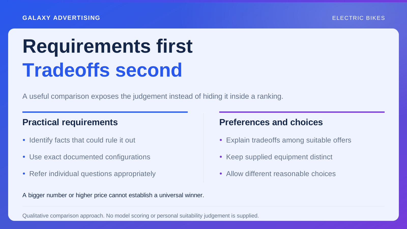
Explain verified differences plainly while preserving access to detail. Avoid ranking one model as the universal winner regardless of a person's requirements. General guidance needs room for different priorities and questions that remain individual.
Compare configurations and contents consistently. A styled photograph with additional equipment shouldn't create an apparent advantage over an image showing only the supplied bike. Establish a fair information basis before interpreting interest in one option as a meaningful choice between the actual offers. Otherwise, the page may be comparing presentation more than packages.
Use assistance when circumstances determine the answer
Explain what your business can help establish and how the customer starts the conversation. Ask for information relevant to the actual service. A long form may look comprehensive while contributing little to a useful response.
Keep ordinary documented answers available on the page. Withholding factual information simply to generate enquiries doesn't improve the route. Let someone resolve what they can independently, then make the appropriate conversation easy to understand.
Don't imply a generic remote exchange verifies conditions nobody has observed. A credible next step might locate suitable guidance or arrange further assistance. Its value comes from the process and honest boundary. You don't need to promise immediate resolution of every personal requirement for the offer of help to be useful.
Show services where they affect the purchase
Explain relevant delivery, appointments or support where you offer them. Distinguish included services from optional or separate arrangements. The customer needs to understand the complete purchase, rather than infer everything from a broad reassurance.
Use consistent language in the destination and subsequent steps. A generous sounding landing page can create expectations the later detailed explanation doesn't support. Keep the scope recognisable throughout the route so clarification doesn't feel like discovering a different offer.
Place important conditions where they influence the decision. A footer link can't reliably correct an expansive impression created above it. Aim for enough context to proceed responsibly, without requiring a reader to work through an entire service archive just to identify the next step. Useful visibility and clear scope should work together.
Follow ordinary choices on a phone
Start from the campaign reference and inspect mobile continuity. Does the model, selected option and main explanation remain connected as the layout changes? A good first screen is only the beginning of the check.
Change a configuration, open a specification and return from the basket. Those ordinary actions can reveal whether the route stays coherent. Review what happens through the choices somebody is likely to make, rather than approving the opening view alone.
Pay particular attention to comparison labels and document links. Stacked columns or a reference opening elsewhere can separate a fact from its model. Clear identifiers help preserve the decision. You don't have to reproduce the desktop layout exactly to keep the relationship understandable on a phone.
Decide what happens when the advertised offer disappears
Plan for an unavailable configuration. An alternative can help if you identify it as another offer and explain relevant differences. Silent substitution leaves the customer trying to reconcile a change you haven't acknowledged.
Give the account team a practical update route. Media managers shouldn't have to infer a stock issue from changed page behaviour or unexplained questions. Connect the factual change with the people managing the invitation.
Review older campaign references when the range changes. Returning visitors can see a previous message after the original offer ends. A clear current status and useful onward route preserve understanding even when you can no longer supply the first item considered.
Ask whether the destination answered its question
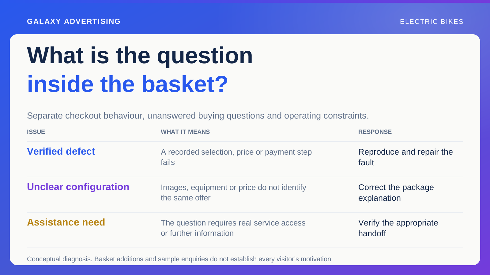
Review relevant product exploration, enquiries and actual orders against the intended task. Longer visits or more interactions can mean consideration or confusion. Choose a concrete improvement, such as clearer packages, a narrower comparison or better access to a documented answer, while keeping causal limits visible.
A useful destination respects the progress already made. Continue that progress with an identifiable model, a manageable choice or a credible conversation, and the page has a clearer purpose than simply being the best looking place to send the click.