Where should you send someone who clicks an advert for a complete living room? The sofa may be the main subject, but the chair, tables and lighting are part of what caught their eye too.
A single product page can leave them looking for the wider arrangement. The entire catalogue can leave them searching for everything they just saw. Start with the creative's promise and the customer's next decision. That gives the destination a commercial job, whether it turns out to be a product page, a focused collection or a room story.
Look at the invitation the customer actually sees
Review the asset without leaning on your campaign brief. Is it demonstrating a particular sofa configuration, introducing a coordinated range or presenting an idea for a room? What your team meant is only part of the picture.
Make that invitation recognisable at the destination. An advert emphasising one arrangement needs a page that identifies it immediately. A scene of complementary pieces needs a route explaining their relationship, without suggesting everything comes in one package.
Write the main next task in a sentence. The page owner then has a practical objective. Otherwise a broad inspirational concept can easily produce a broad inspirational page, with no clear way towards an available offer.
Use a product page when the reference is clear
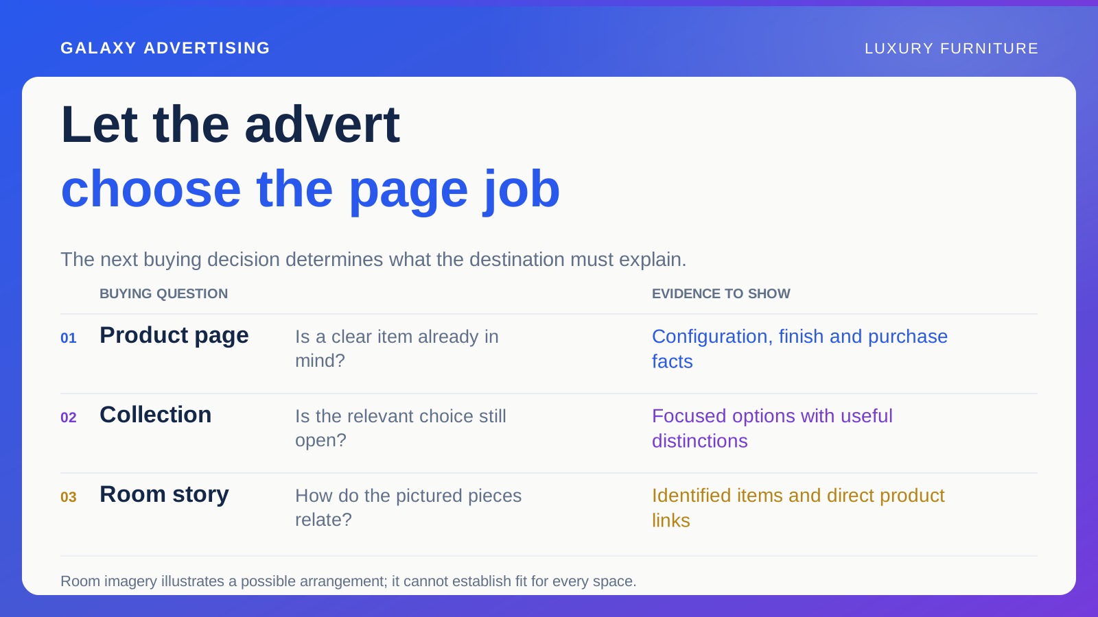
A product destination suits someone with a clear item in mind who needs configurations, finishes, dimensions and purchase conditions. Its opening state should carry through the context established by the advert.
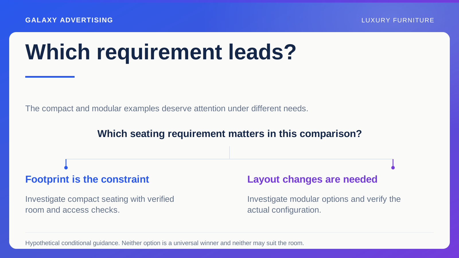
Check the selected arrangement and image. Someone who clicked a corner sofa should not have to untangle why the page opens on a compact version at a lower starting price. The product family can be identical while the offer immediately feels different.
Keep useful buying information, even if removing it would make the page look more like the campaign. The advert can introduce desire; the destination supplies the detail for an informed choice. Their visual relationship matters, but they have different jobs.
Use a collection when the choice is still open
A focused collection helps when you introduce a relevant range rather than a specified item. Keep it tied to the customer's task, with meaningful ways to tell the options apart.
For a hypothetical dining room campaign, you might organise available arrangements by a relevant documented characteristic. Choose a grouping that helps comparison. Reproducing a supplier's internal catalogue structure without explanation may make sense to the supplier and very little sense to the visitor.
Do not add unrelated products just to fill the page. A broad style label alone is a weak reason to make customers sift through a large assortment for the idea they saw. The boundaries of your focused selection should have a purpose.
Let a room story lead somewhere useful
A room story can explain how pictured pieces relate and identify what is shown. Label each item, distinguishing styling objects from purchasable components. Make the reference clear when the scene shows a particular finish or arrangement.
Link directly to the relevant product information. Once somebody becomes interested, they should not have to search for the same object again. Connect each route to its specific item rather than putting identical generic calls to action everywhere.
Keep the room imagery in its proper role: an illustration of a possible arrangement. It cannot guarantee the products will suit every space. Provide accurate dimensions and appropriate routes to further buying information so customers can assess their own circumstances.
Make an extra page earn its place
A dedicated campaign page needs to do more than enlarge the advert. What decision does it make easier that your current product or collection route cannot support? Give that question a clear answer before you commission it.
If the answer is vague, improve the existing destination instead. Every extra page needs maintaining. It can also leave people walking through repeated introductions before they reach the detail they came for.
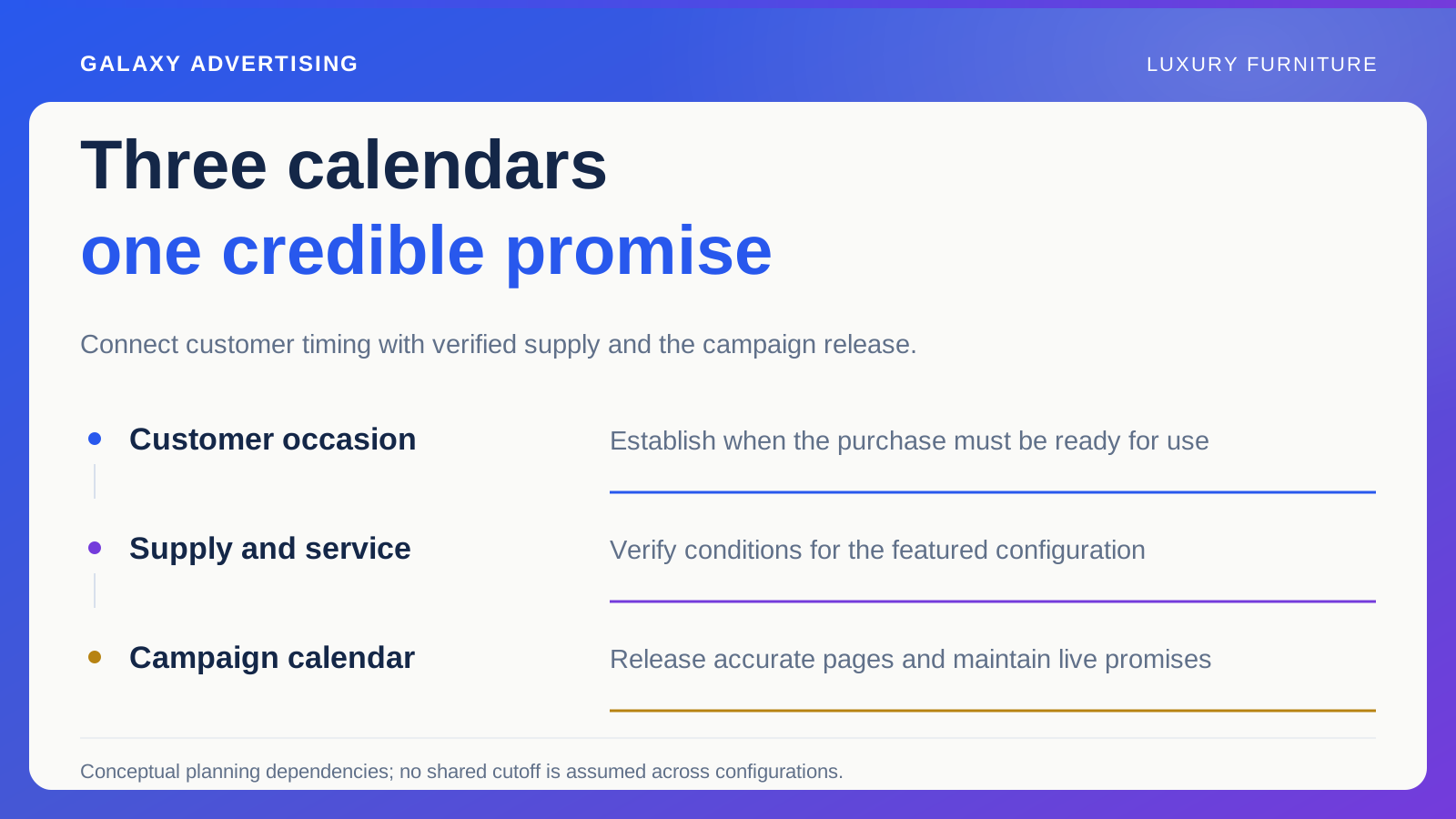
When a new page is justified, define what information it owns and what it links to. Availability needs a reliable source. Copying it into several manually maintained places creates opportunities for those versions to drift apart during the campaign.
Follow the transitions on a phone
Use the actual asset and destination as a new customer would. Identify the pictured item, select a relevant option and locate the information needed to continue. Do the meaningful steps, rather than just checking that the link opens.
Ask whether each transition preserves the context. An intermediate page might describe one finish while its product link opens on another. A collection tile might use an outdated arrangement image. Those are specific issues you can correct before interpreting the campaign's performance.
Include price and service in the review. A route can look beautifully consistent and still change the package or delivery explanation unexpectedly between pages. Continuity applies to the whole offer, not only its colour palette.
Judge the page by the task you gave it
Choose observations that relate to the intended job. A room story might help people identify several products. A product destination might support a particular configuration decision. Different tasks can produce different interaction patterns, so do not judge them as identical experiences.
Keep commercial outcomes in view, but do not credit every purchase to the latest page change. Stock, campaign mix and other conditions can affect the result. Explain the evidence alongside its limits.
The destination continues a buying conversation. Your customer needs to recognise the advertised idea, investigate the real offer and find a useful next step. That gives you a firmer reason for choosing a page than fashion, habit or the template you happened to use last time.